Check out the final reveal for our full home and kitchen remodel and renovation on a 1970’s original bungalow transformed into a coastal inspired earthy Scandinavian retreat!
*this post contains affiliate links*
 All photography by Tracey Jazmin
Our Home & Kitchen Remodel Final Reveal
The day has arrived for this much anticipated FINAL REVEAL and I couldn’t be more excited! Our 8+ month home and kitchen remodel has finally come to a close and we have moved and settled in over the past month.
It’s been so fun getting each room decorated little by little and watching the vision I had from the beginning come to life. If you haven’t been following along you can catch up by checking out Part 1: The Before & Design Concept and Part 2: The Progress of our home renovation series on the blog.
For our renovation my hubby and I worked with the most amazing team and brands including Alair Edmonton and Kresswell Interiors for the contracting and design, Vera Kitchens and Kitch Canada for our beautiful custom kitchen and bathroom cabinetry, Hanstone Canada for the gorgeous quartz counters and backsplash we have throughout the house, and Mitzi Lighting for many of our stunning light fixtures.
The Bungalow “Before”:
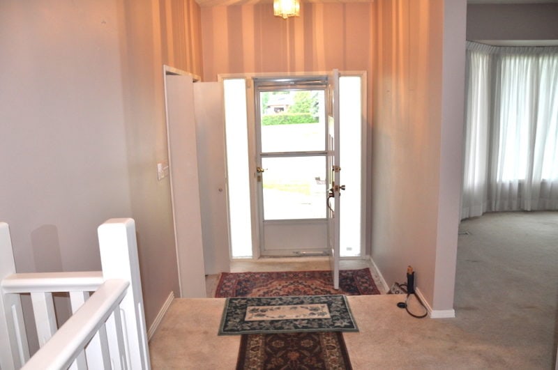
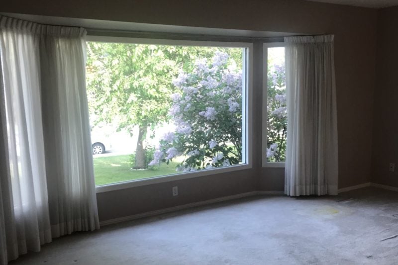
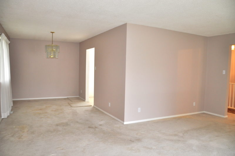
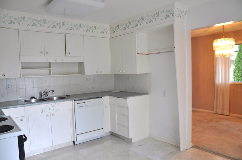
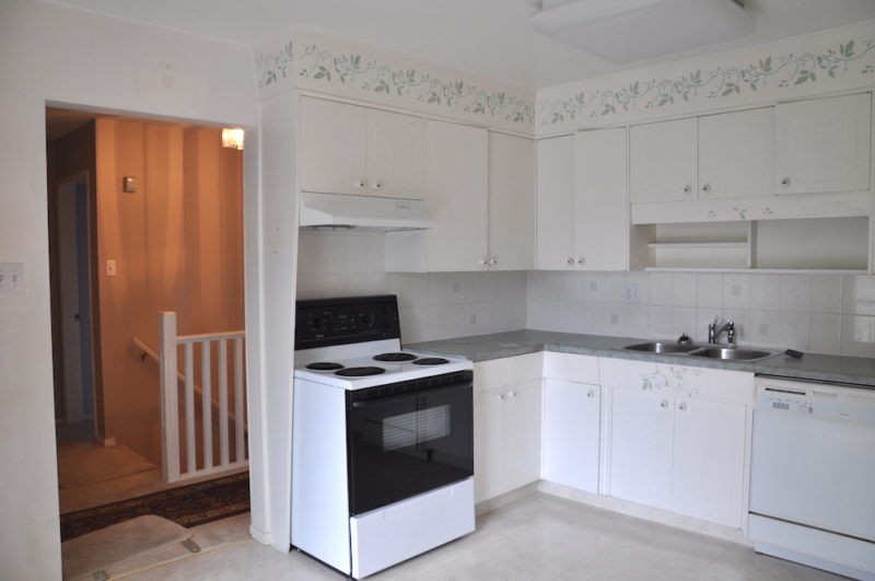
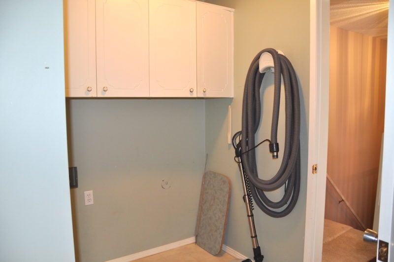
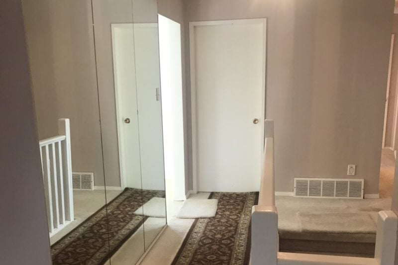
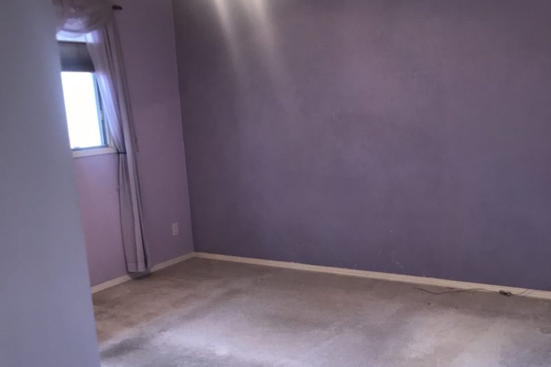
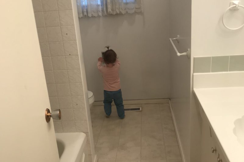
While I don’t want to focus on the minty green and purple shag state of this 1970’s bungalow, the before pictures are definitely worth a peak at to get the full gist of how intensive and massive this renovation actually was. This home was in it’s full original state when we purchased it last summer and while it definitely wasn’t a looker at the time my hubby and I both saw the incredible potential.
We loved the neighbourhood and the large mature treed lot, as well as the layout and size of the bungalow as it was not too big, just perfectly spacious for our family and needs at just under 1,500 sq ft above grade (2,700 in total including the basement which we also fully renovated but are not including in this post).
As you can see from these not so great iPhone photos… she was a “diamond in the rough”, the real rough to say the least, but structurally the house was very sound and had been well maintained over the years, aside from aesthetics.
The Bungalow “After”:
Now to the juicy part of this post (and obviously the best part of any HGTV show) the “After”! While my husband and I did do a full top-to-bottom renovation, including most of the exterior, for this post I wanted focus on the main areas; the living and dining room, the kitchen, main hallway, mudroom and butler’s pantry, master bedroom and master bathroom, as well as the main bathroom.
The Entry & Main Hall
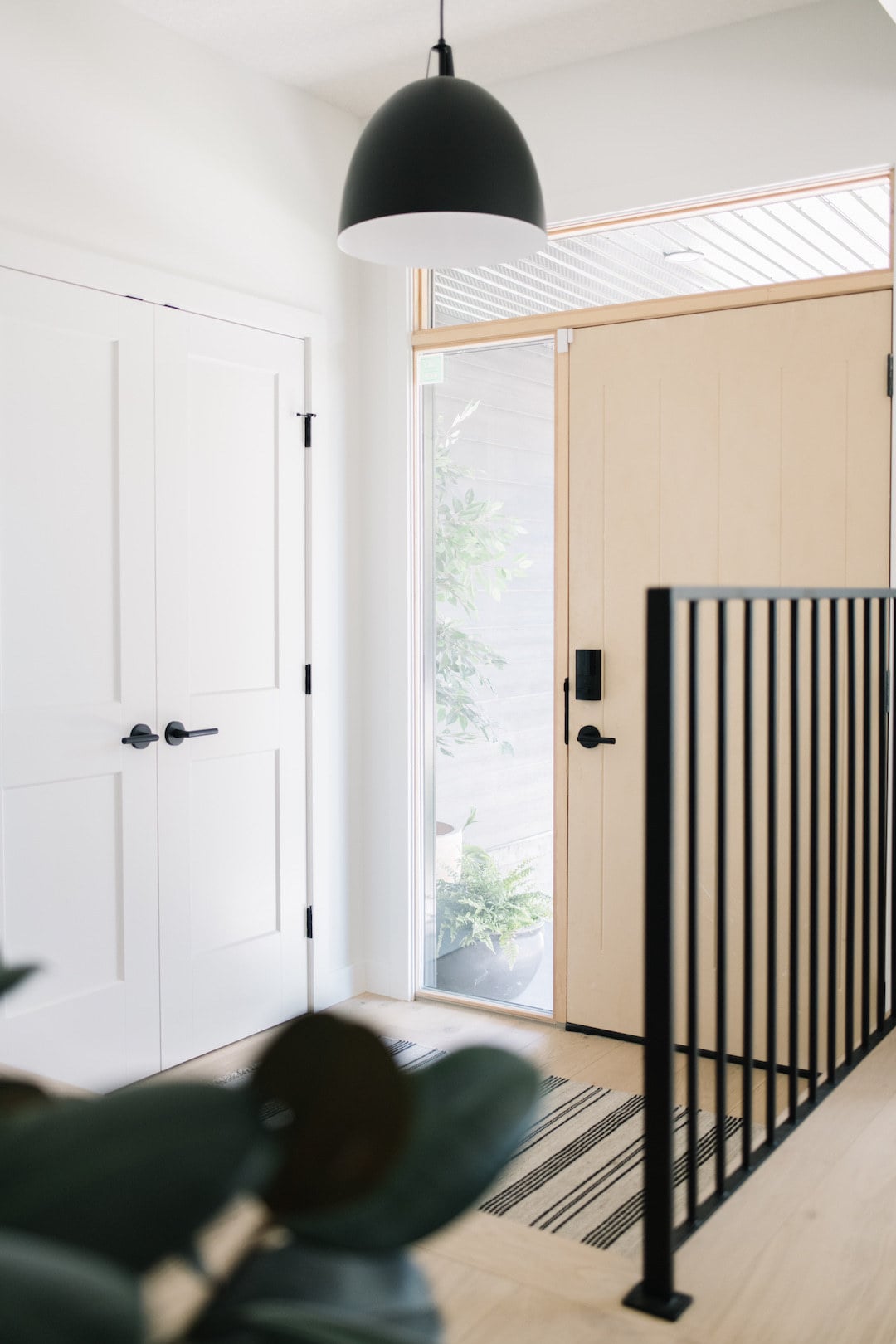
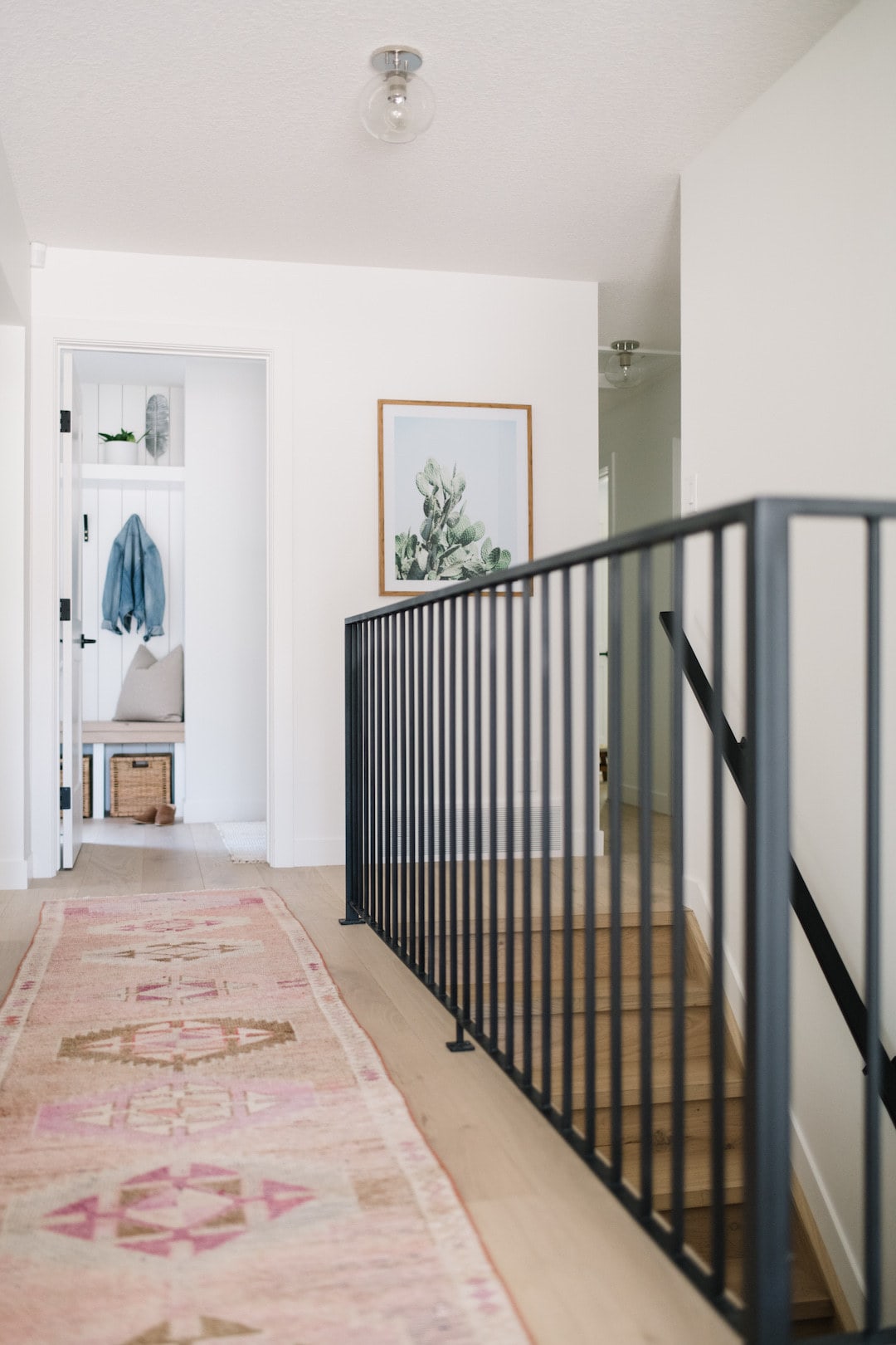
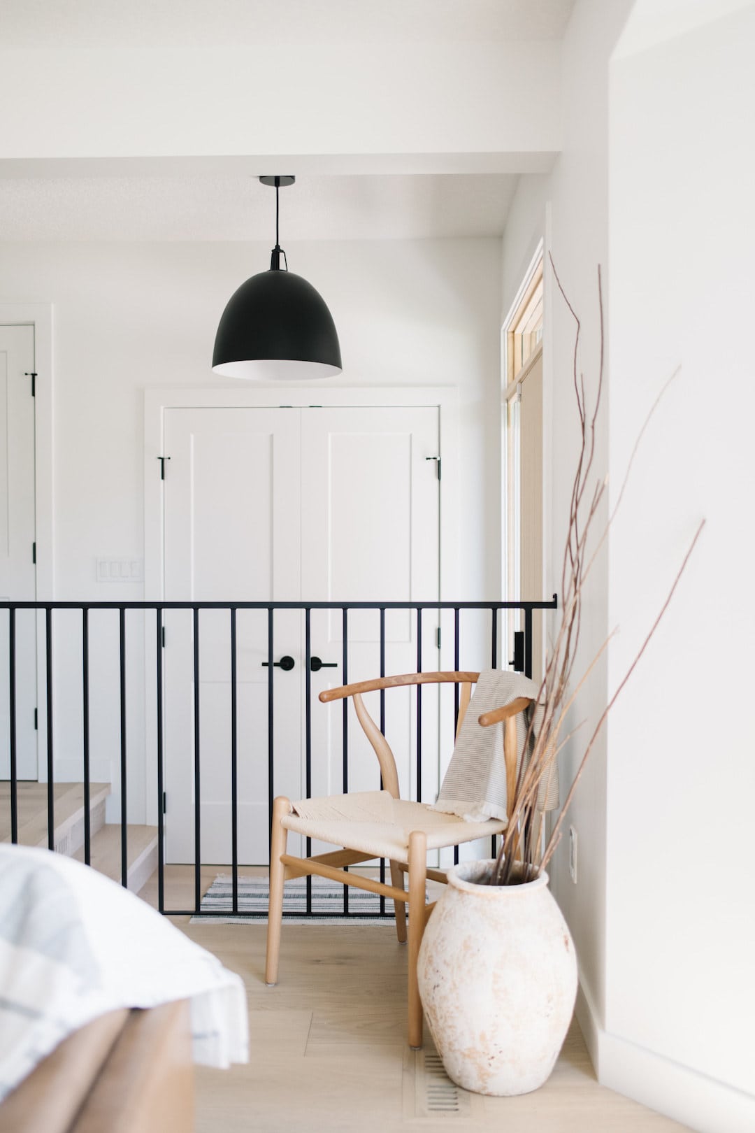
In this area our focus was to create a “grand entry” by adding extra natural light and modernizing the space. We removed a wall in the front entry, added extra windows and a stunning modern front door, and these beautiful custom built black railings that give the space a Scandinavian vibe. I also love the black hardware for the doors that adds a pop of contrast to the bright and airy space and the Margot Flush Mounts by Mitzi to add the perfect amount of lighting.
The Living Room
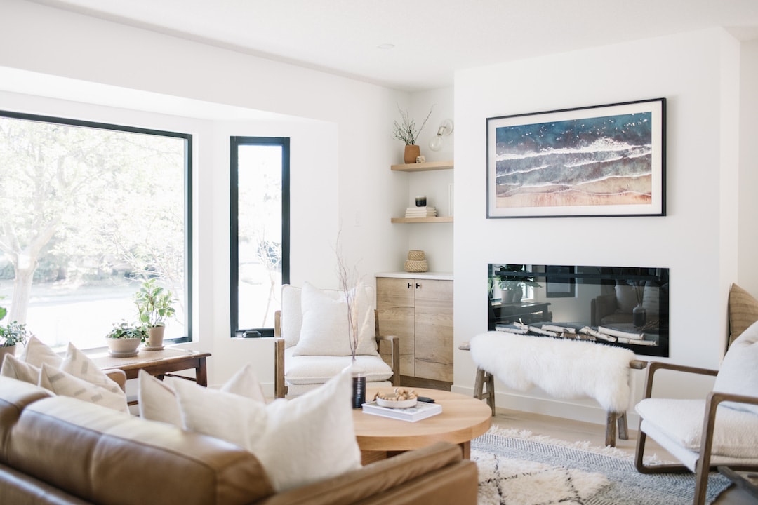
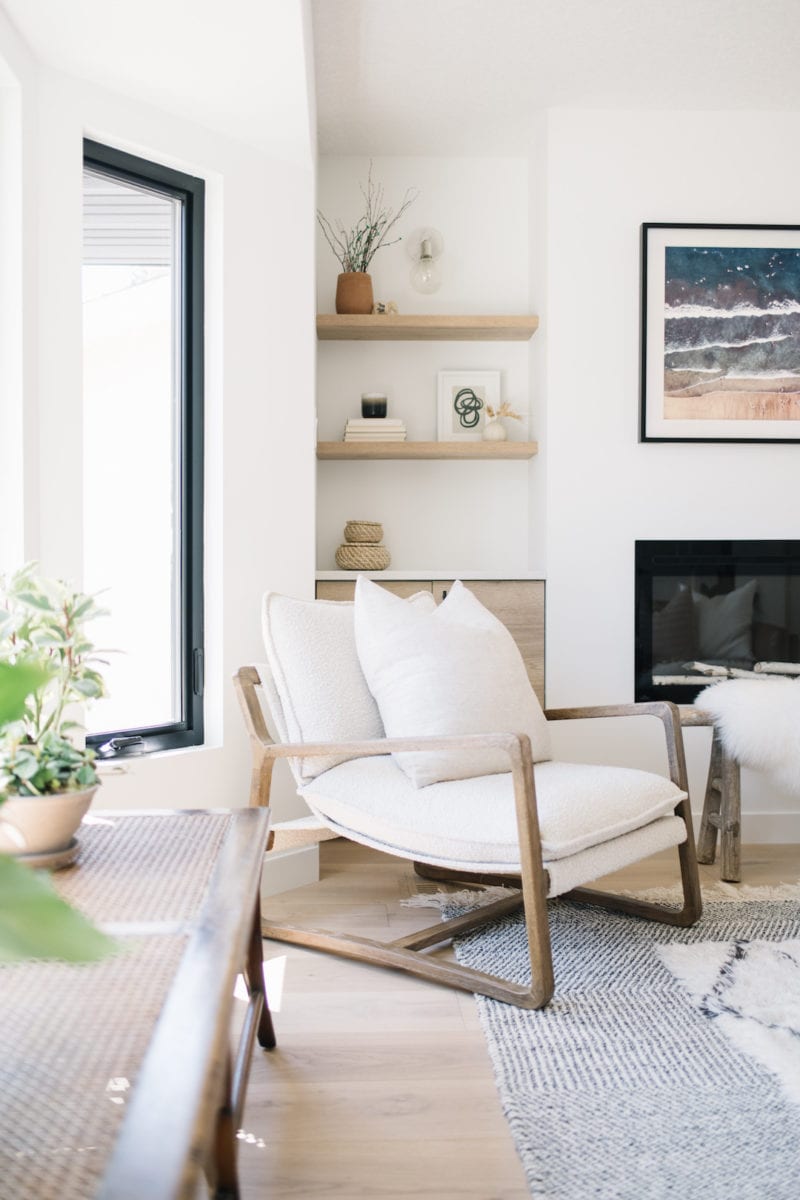
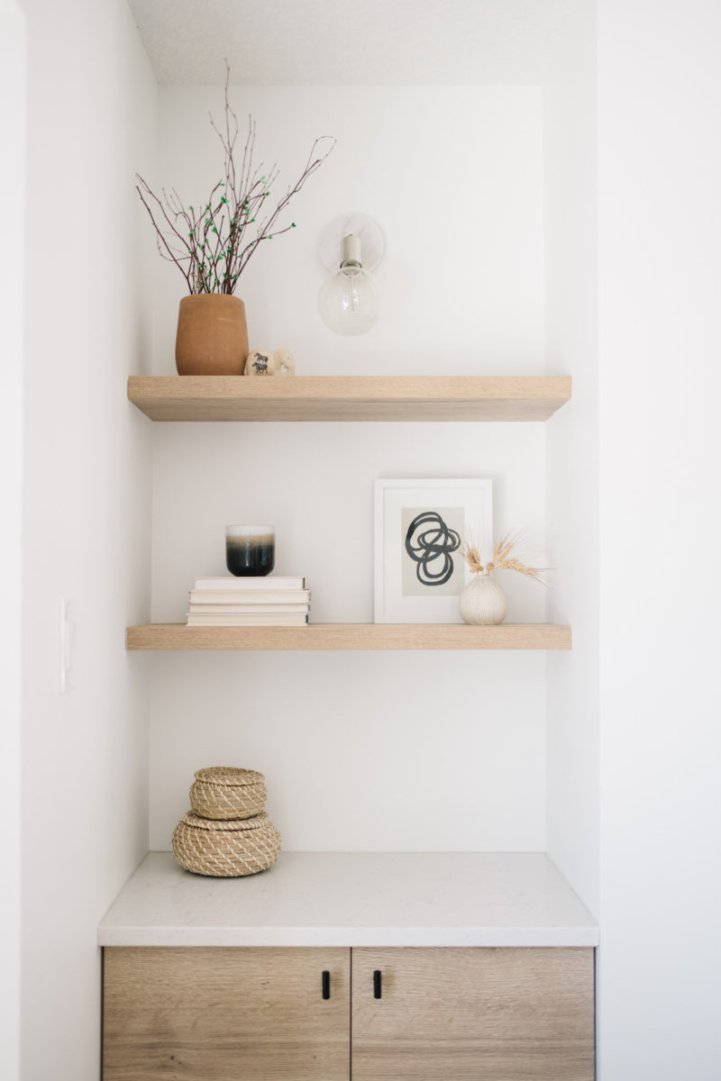
The built in shelving is Natural Halifax Oak from Kitch as well as the custom cabinetry beside the fireplace, topped with the gorgeous Hanstone Whistler Quartz. I love the Kitch floating shelves for simple, natural styling, done by the Kresswell team, and the classic but statement Chloe Sconce by Mitzi which adds a beautiful warm light in the evenings.
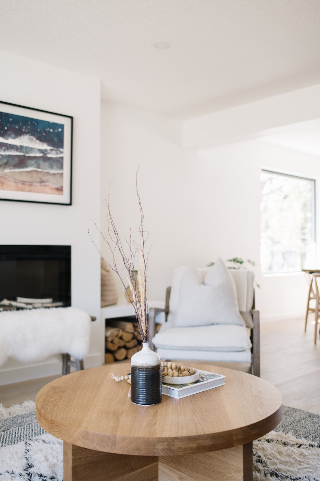
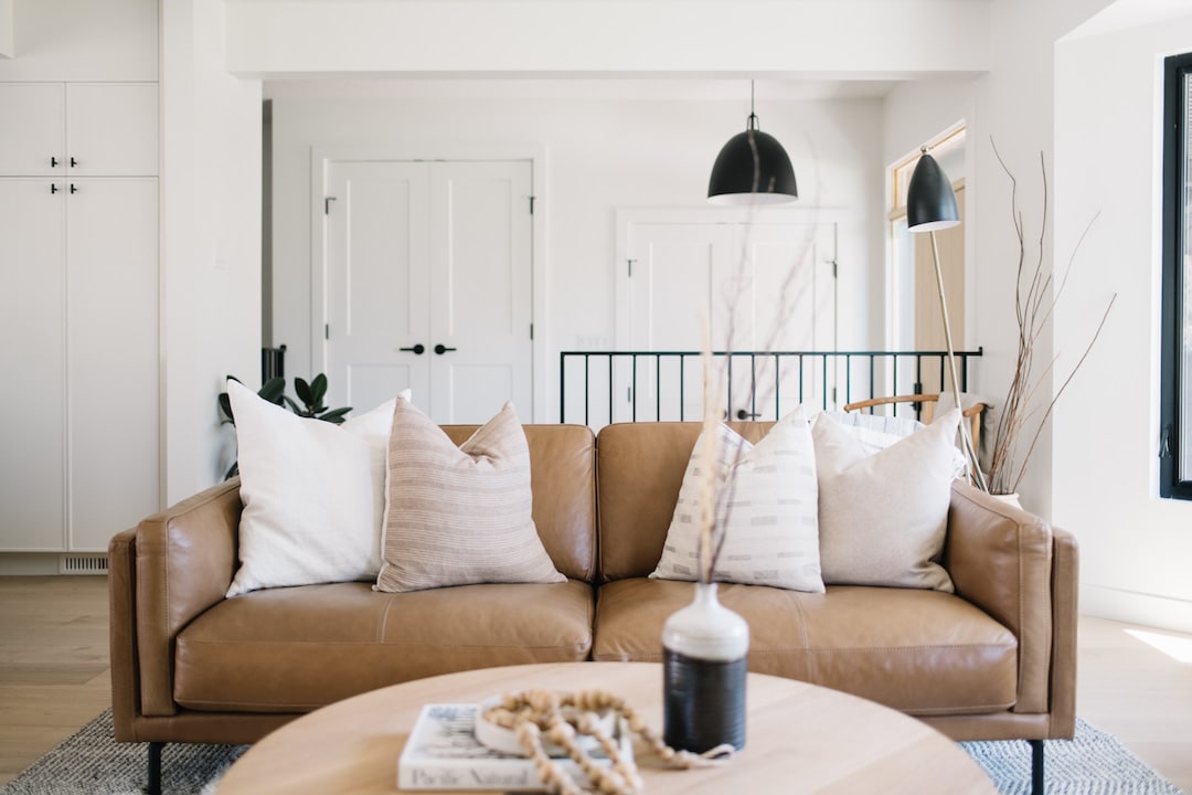
My goal for the decor was to keep things really earthy, natural, and Scandinavian inspired so I stuck with neutral tones and materials throughout with lots of natural woods including a gorgeous custom white oak coffee table made by a local company, Oliver Apt. and neutral cushions from Uusi Studio, Nordeco, and PrairieThreadDesign.
The Kitchen
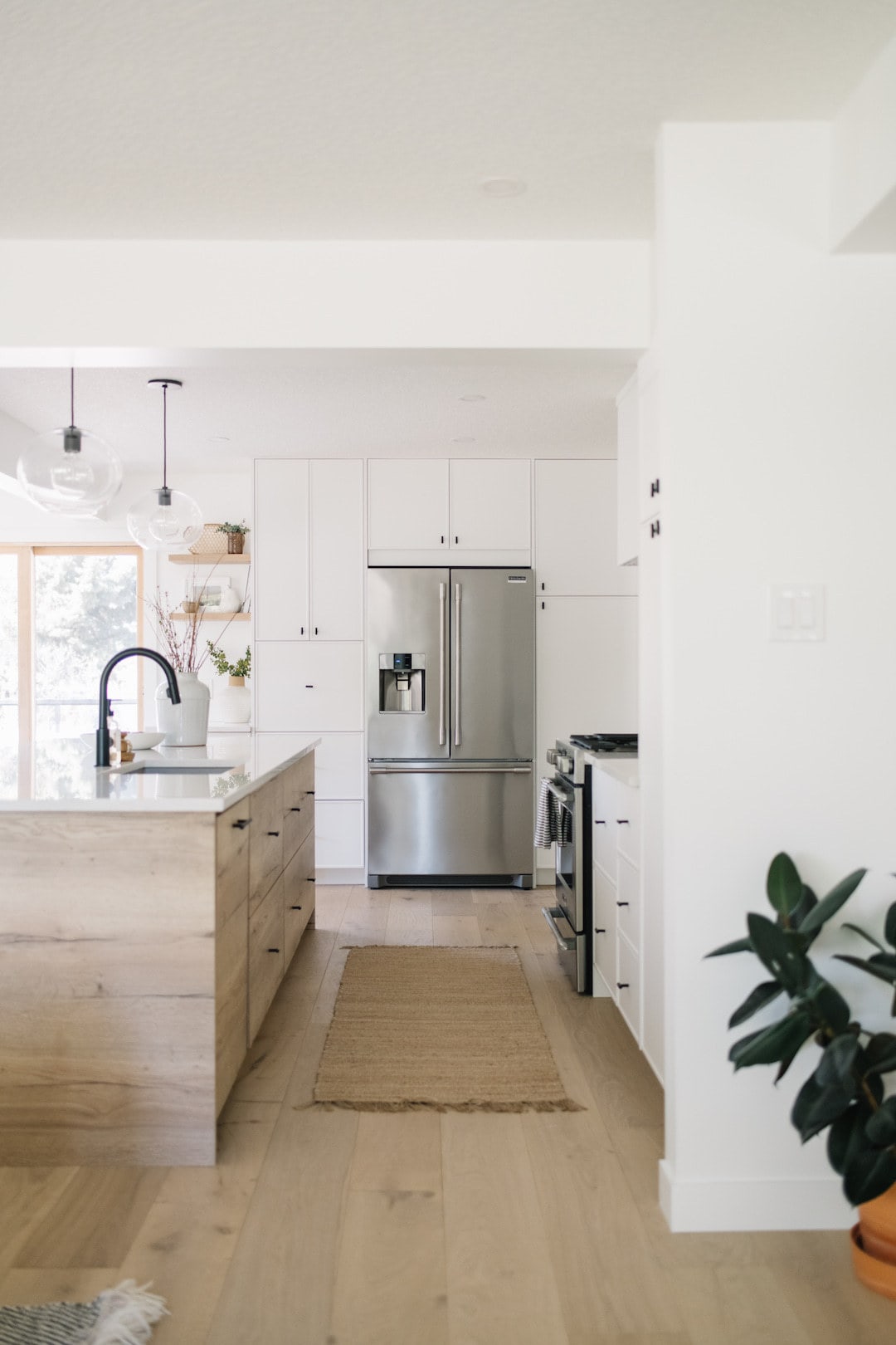
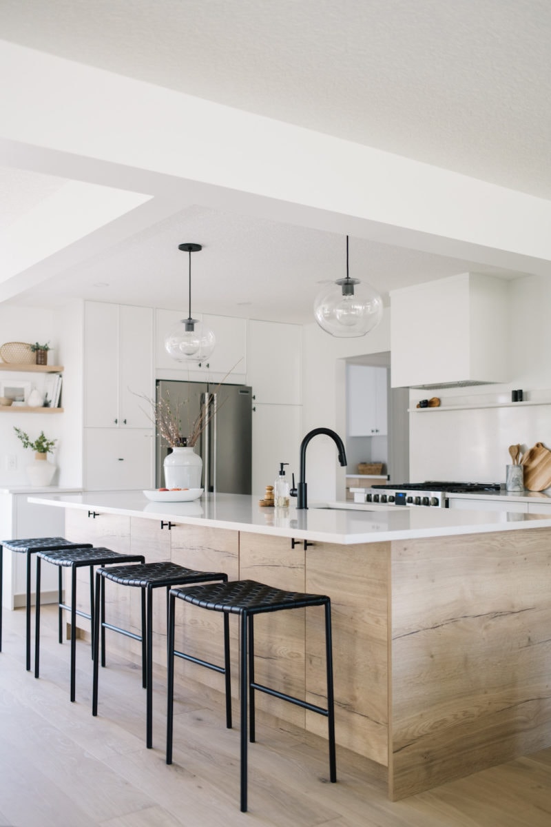
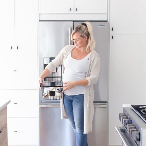
I truly can’t even express how thrilled I am with the kitchen as not only is this my “home office”, it’s truly the heart of the home and where I come alive. Every single day since we’ve moved into the house I’ve found myself spending lots of time in the kitchen getting aquatinted with the layout and appreciating all of the natural light, neutral tones, organized cabinetry (thank you Kresswell Interiors for a fantastic design!), and just the overall vibe.
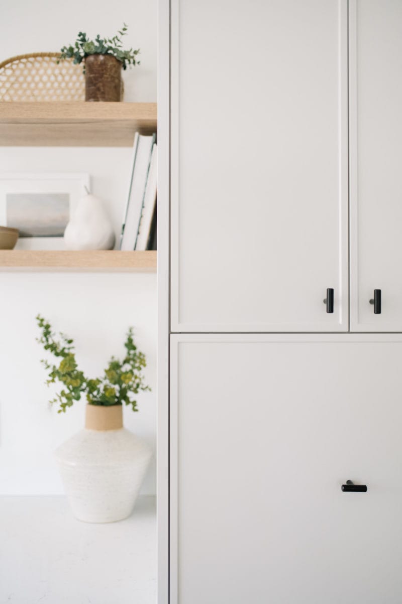
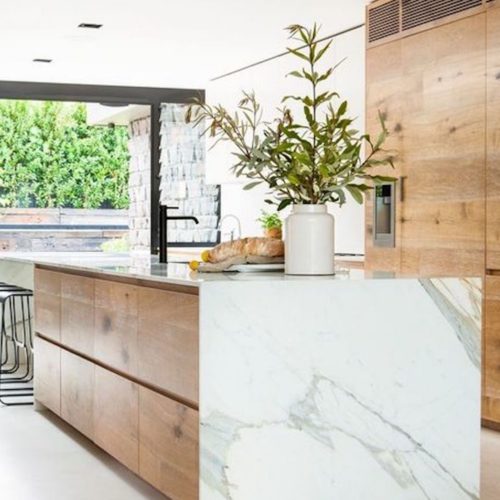
We chose to go with Ikea cabinets and Kitch custom fronts in Natural Halifax Oak (the wood cabinetry) and Slim Shaker in Stratus (the white cabinetry). The simple black hardware pops on the white and wood tones and I love the clean, modern, but still slightly traditional mix the cabinets give. We have so much storage in the kitchen I honestly don’t know what to do with it all!
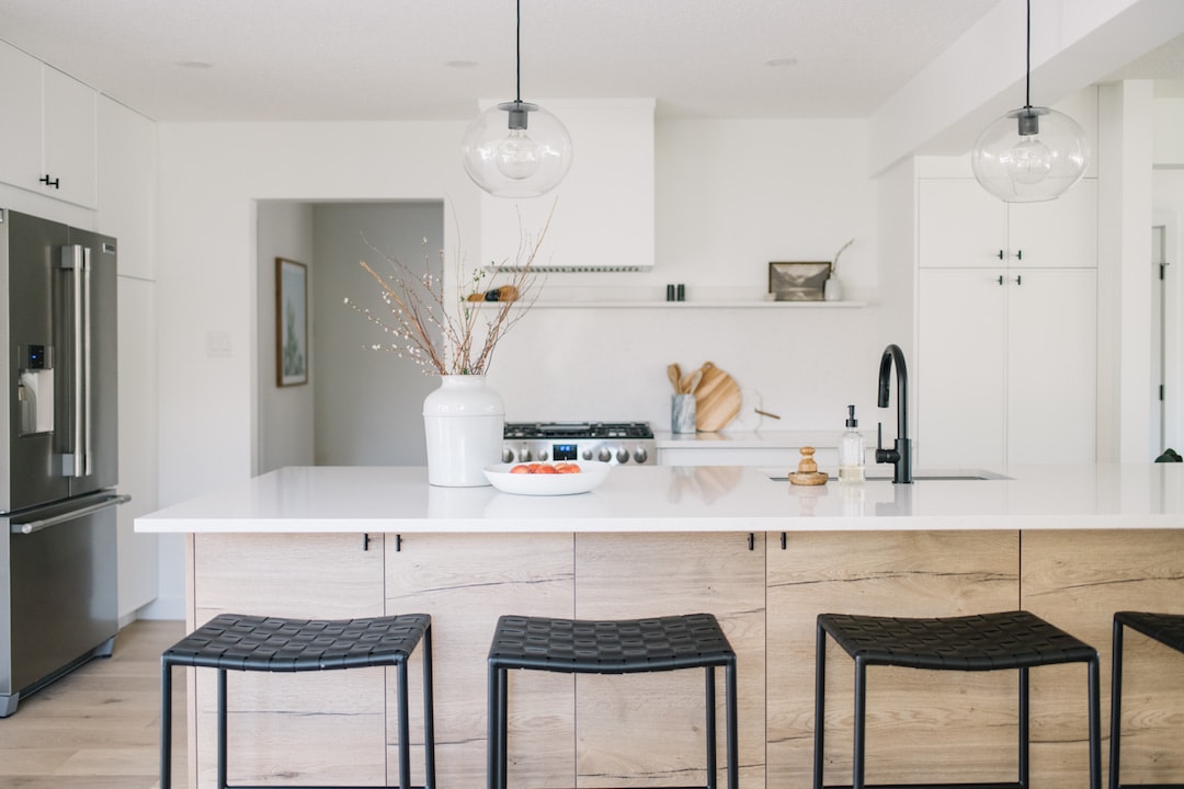
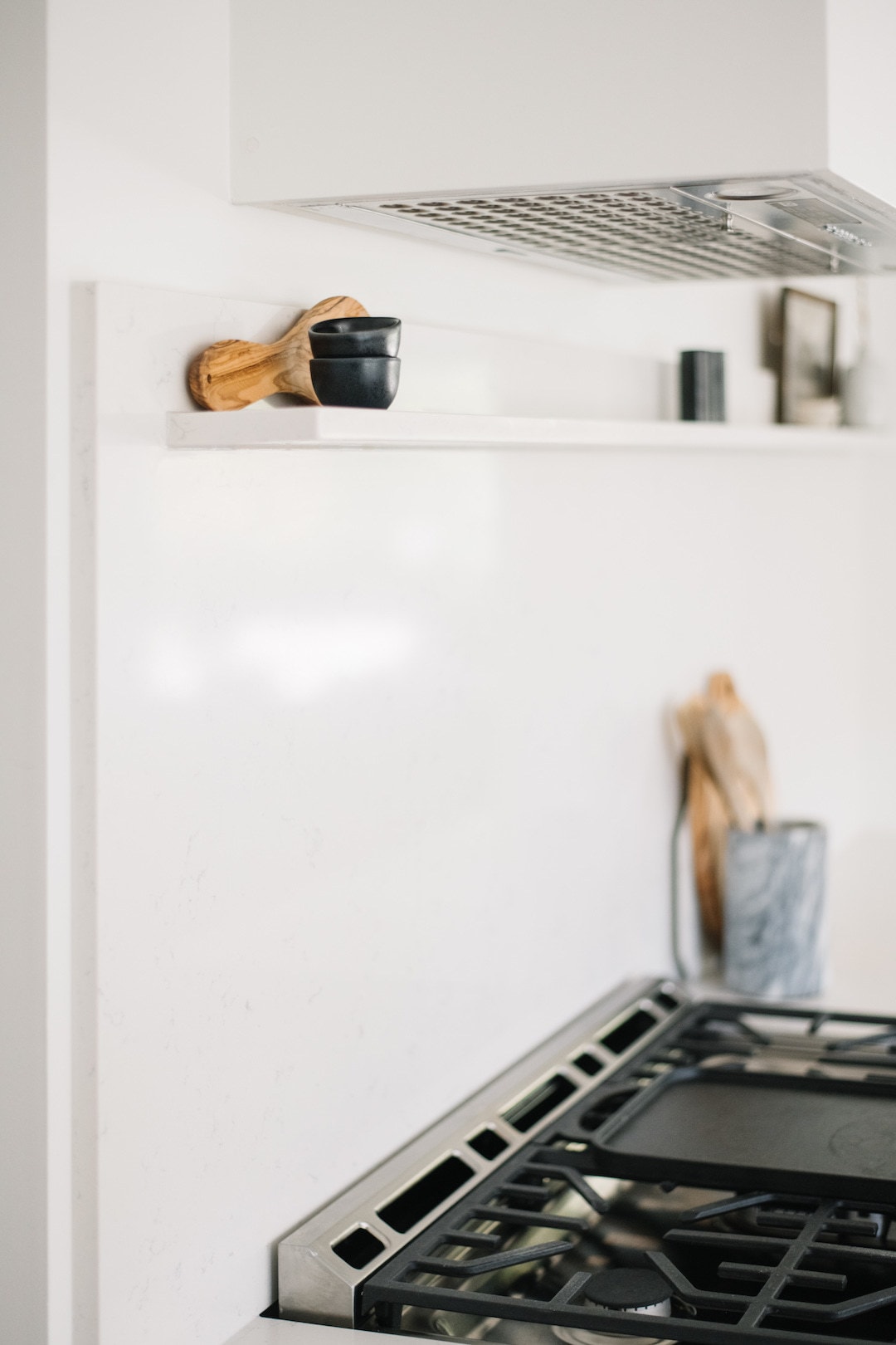
For the quartz countertops we went with Hanstone Canada “Whistler” and carried the quartz all the way up for the backsplash and to create a small ledge for decor and small kitchen items like olive oil and salt and pepper shakers. This quartz is durable, practical, and still creates a serene, stunning feel to the kitchen as it has a whimsical warm grey veining that blends wonderfully with the natural elements.
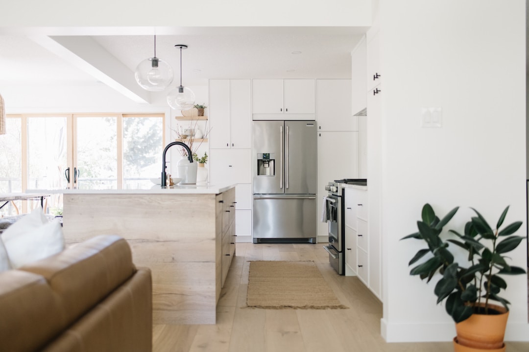
The two minimal and classic kitchen pendants are the Margot Pendants by Mitzi in old bronze, and they add a wonderful warm moody light for entertaining and a nice touch of black to the space without being overly distracting. I wanted an “airy” feel to the lighting in the kitchen and these pendants do the job wonderfully.
The Dining Room
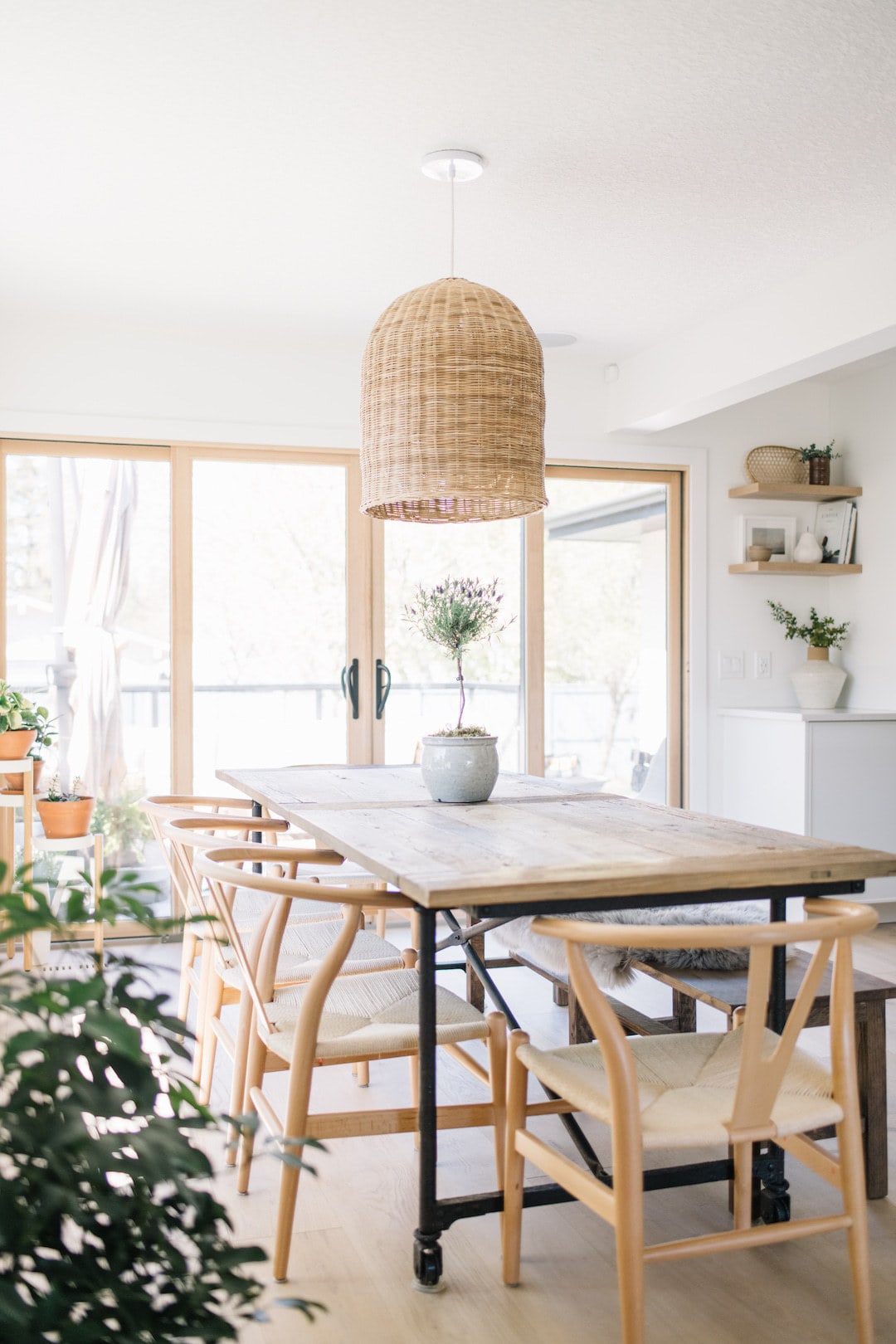
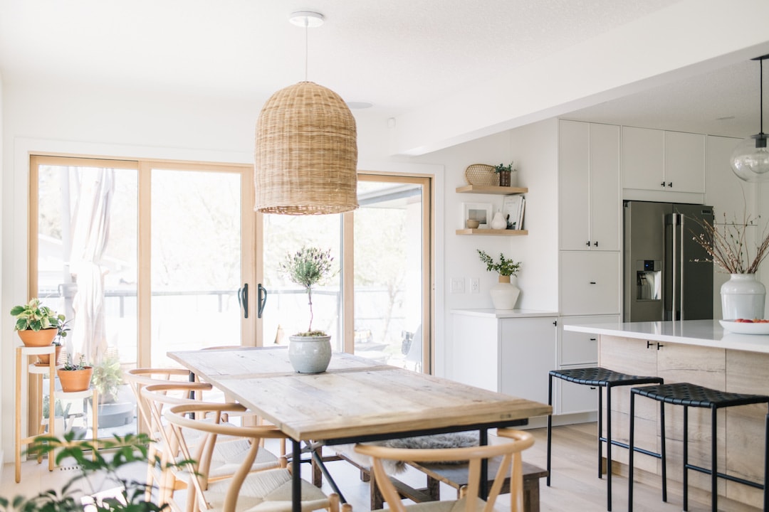
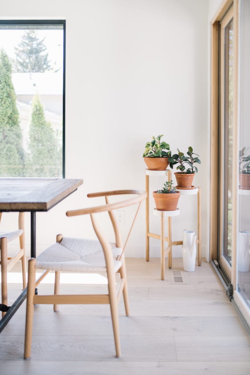
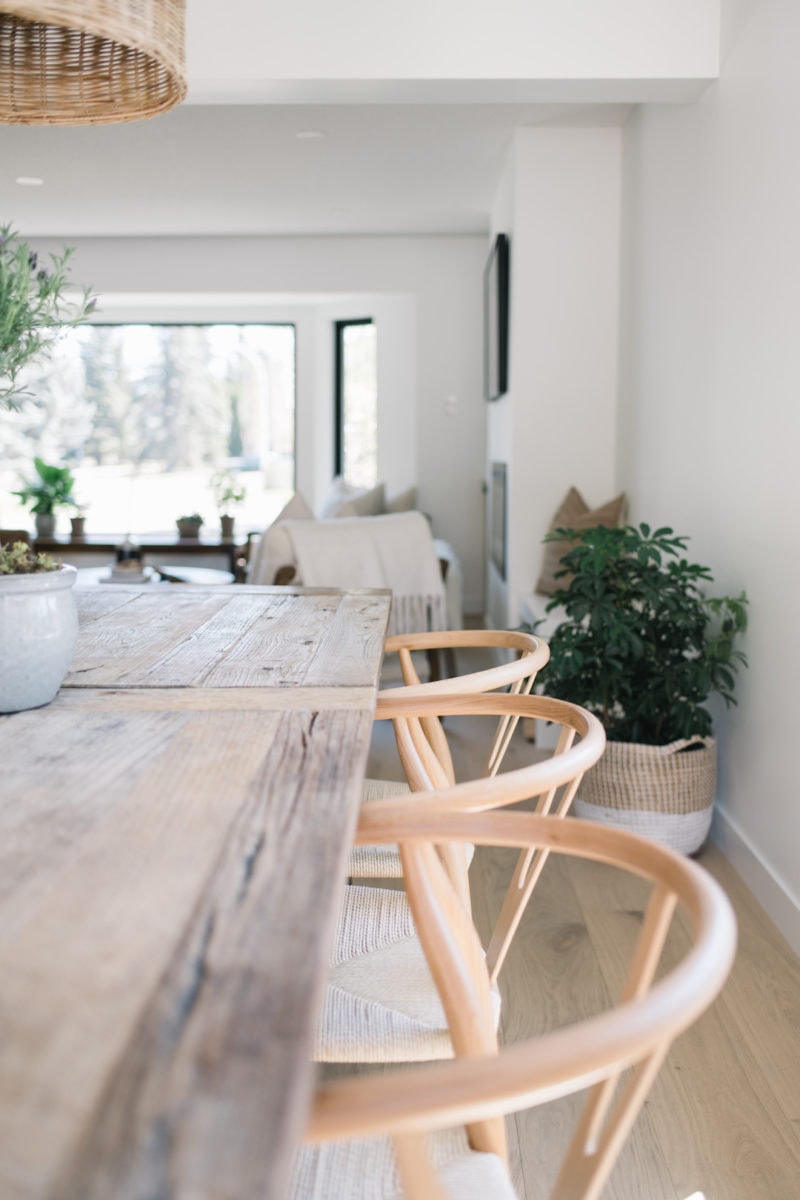
In the dining room we kept the same Scandinavian vibe going with natural woods in the dining table, wishbone chairs, large slider doors that lead out to the patio, and white oak hardwood floors. I focused on adding lots of plants to frame the space and create a relaxing, earthy feel that is inviting and informal as we love to host and gather around the table often for delicious meals.
The Mudroom & Butler’s Pantry
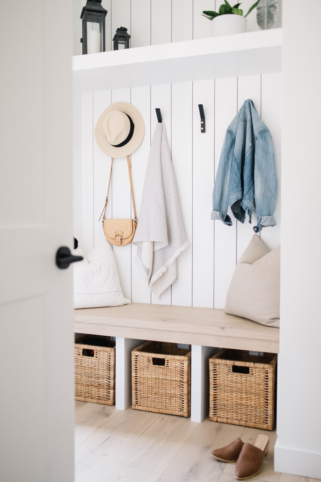
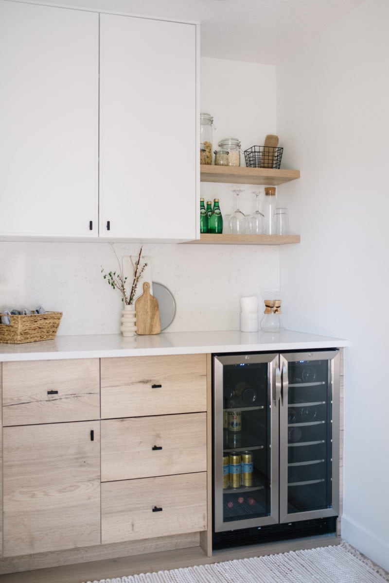
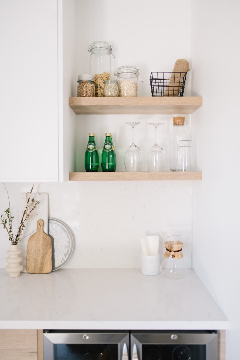
The mudroom was originally very dark and dated and doubled as the laundry room which we relocated to the basement so we could create a functional butler’s pantry to use as an extension of our kitchen. As I said before, my hubby and I love to entertain so to have an extra preparation space and a place to keep our wine and glasses along with other kitchen extras was a great plan for us.
We chose to mimic the design of the kitchen and carry the Kitch Natural Halifax Oak and Slim Shaker cabinetry, Halifax Oak floating shelves, and the Hanstone Canada Whistler quartz for the countertop and backsplash in the space. We also put a Margot Flush Mount by Mitzi in the mudroom as well to keep consistency as this space extends from the hallway.
I absolutely love how this once unusable nook turned out as it’s now such a practical, lovely and airy space that serves many purposes, including an eating spot for the cats too!
The Main Bathroom
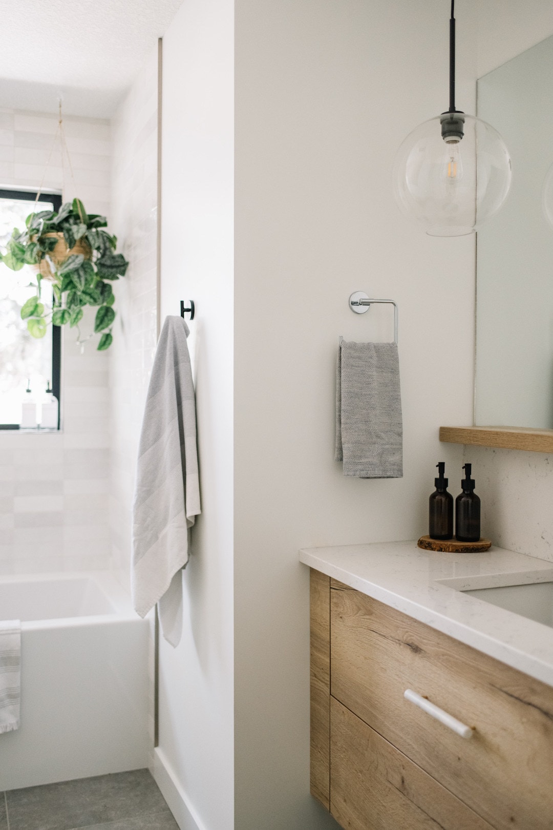
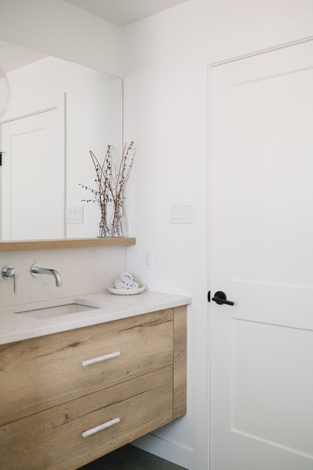
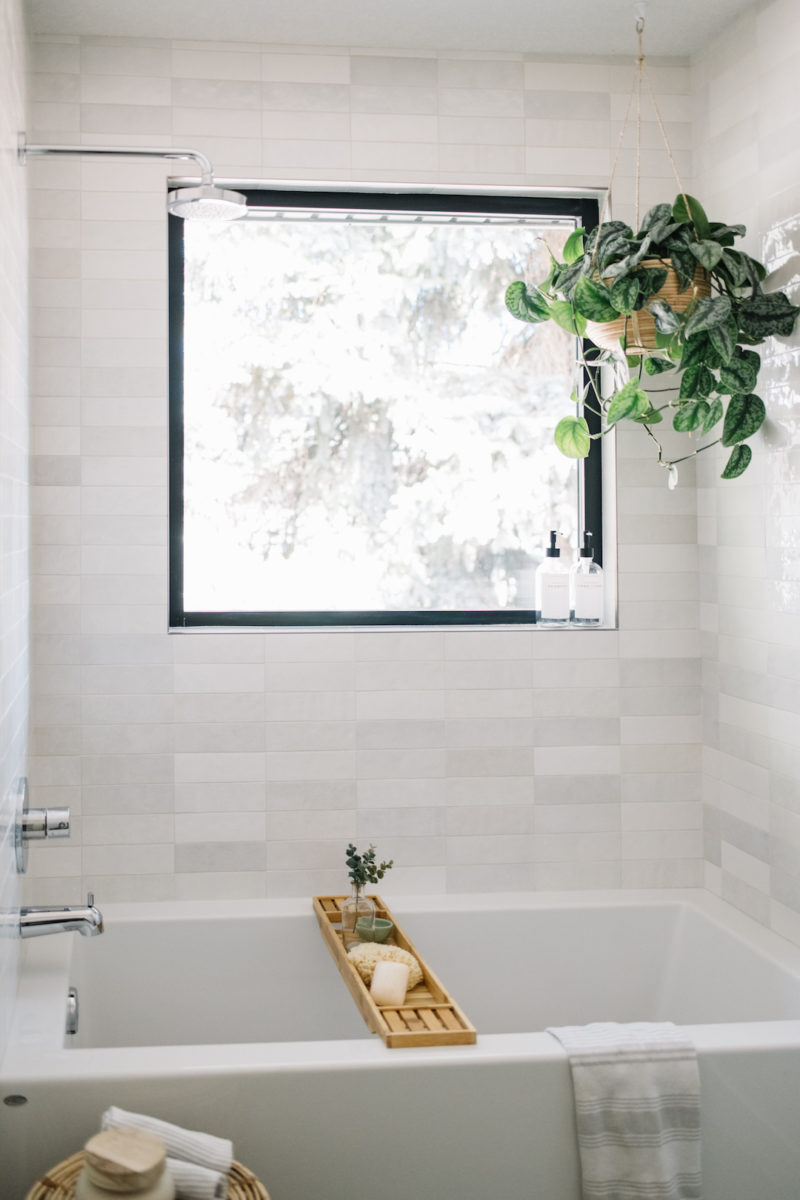
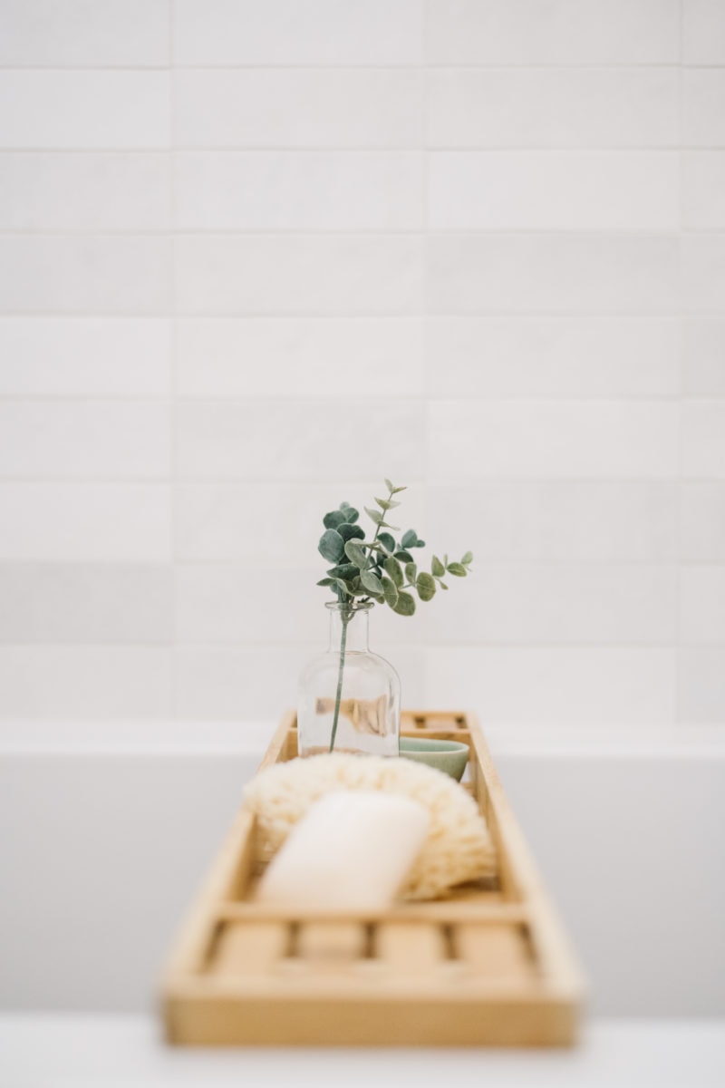
In the main bathroom we changed the layout as it originally didn’t make much sense and moved the tub/shower to the window. I love how much natural light this airy bathroom gets and it brings the consistency throughout with the Kitch Natural Halifax Oak and Hanstone Whistler quartz for the vanity. We chose a beautiful artisan tile introduced to us by the designers for the shower surround as well as a warm grey toned floor tile, and every day I fall more in love with this space. The bathroom truly has a calming retreat feel and makes for a perfect soaking spot once my toddler has gone to bed!
The Master Bedroom & Bathroom
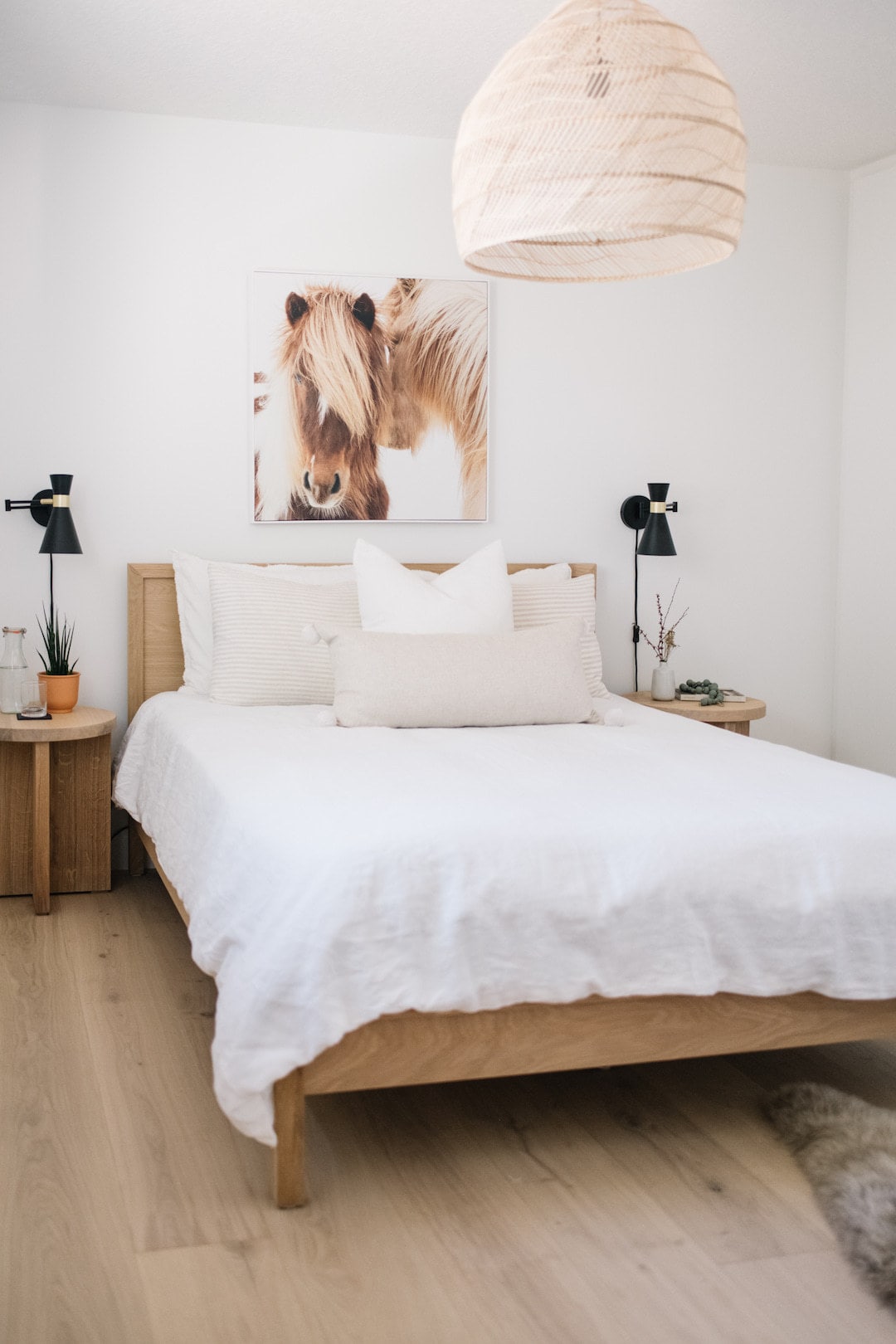
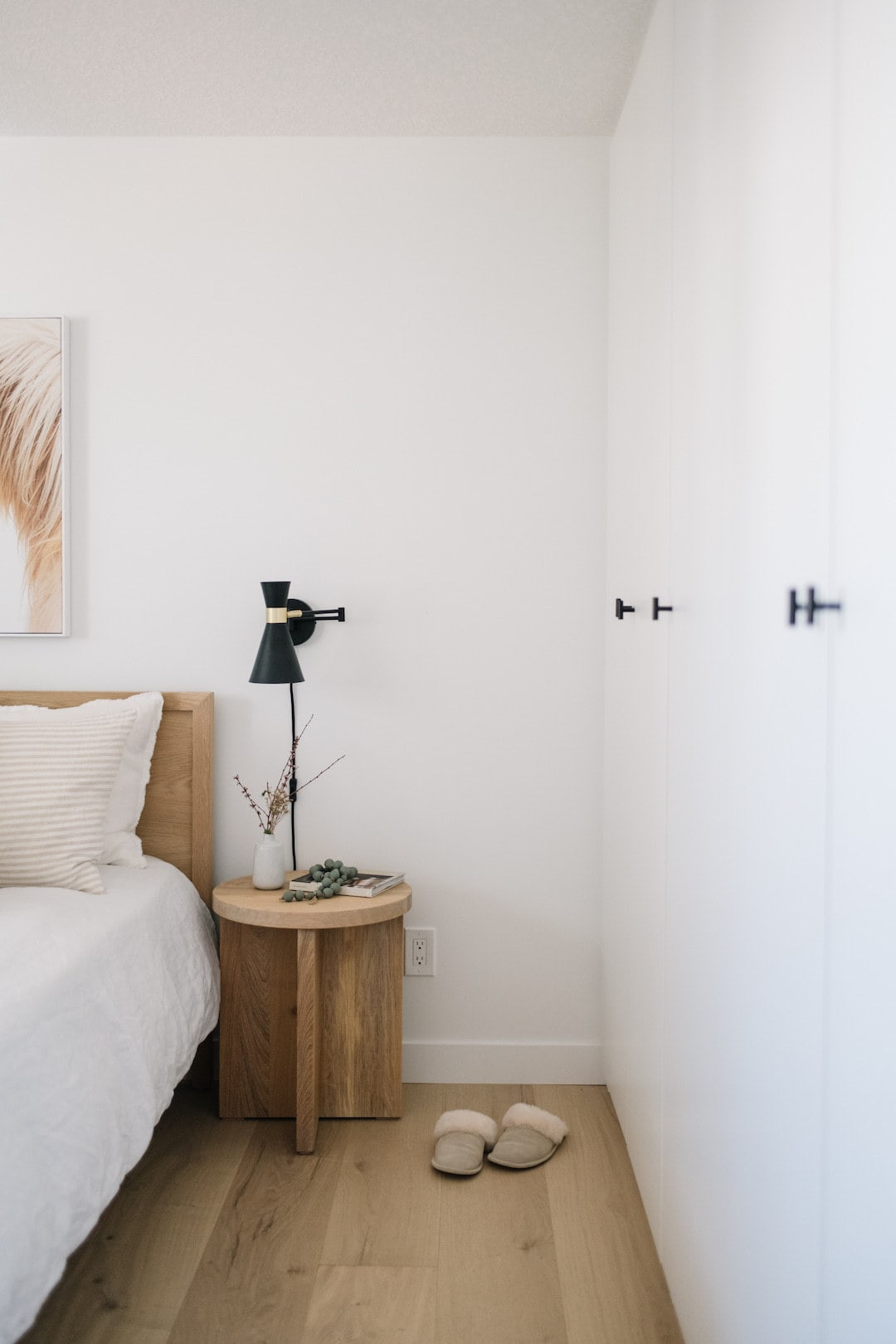
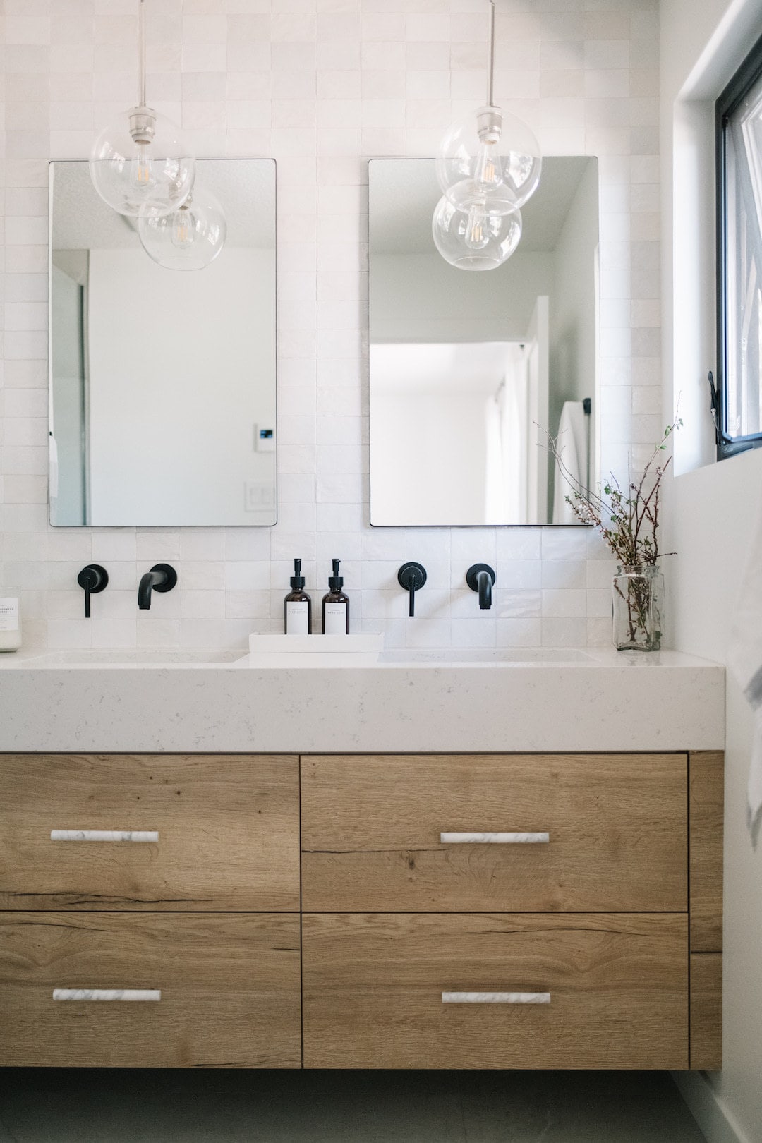
In the master bedroom and bathroom we decided to keep everything very minimal and calming. Vera Kitchens installed a wonderful built-in PAX wardrobe from Ikea that works as our closet as we removed a closet to make the master bathroom shower larger. I actually love the PAX over a conventional closet as it has great organization inside and keeps everything tidy in the room (there’s even built-in laundry hampers!).
We also commissioned a wonderful woodworker I found on Etsy, RhootzBacktoWood to make custom white oak nightstands for us and I couldn’t be happier with how they turned out, and the white linen and neutral cushions on the bed make this the perfect space for rest.
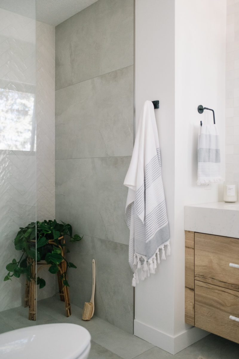
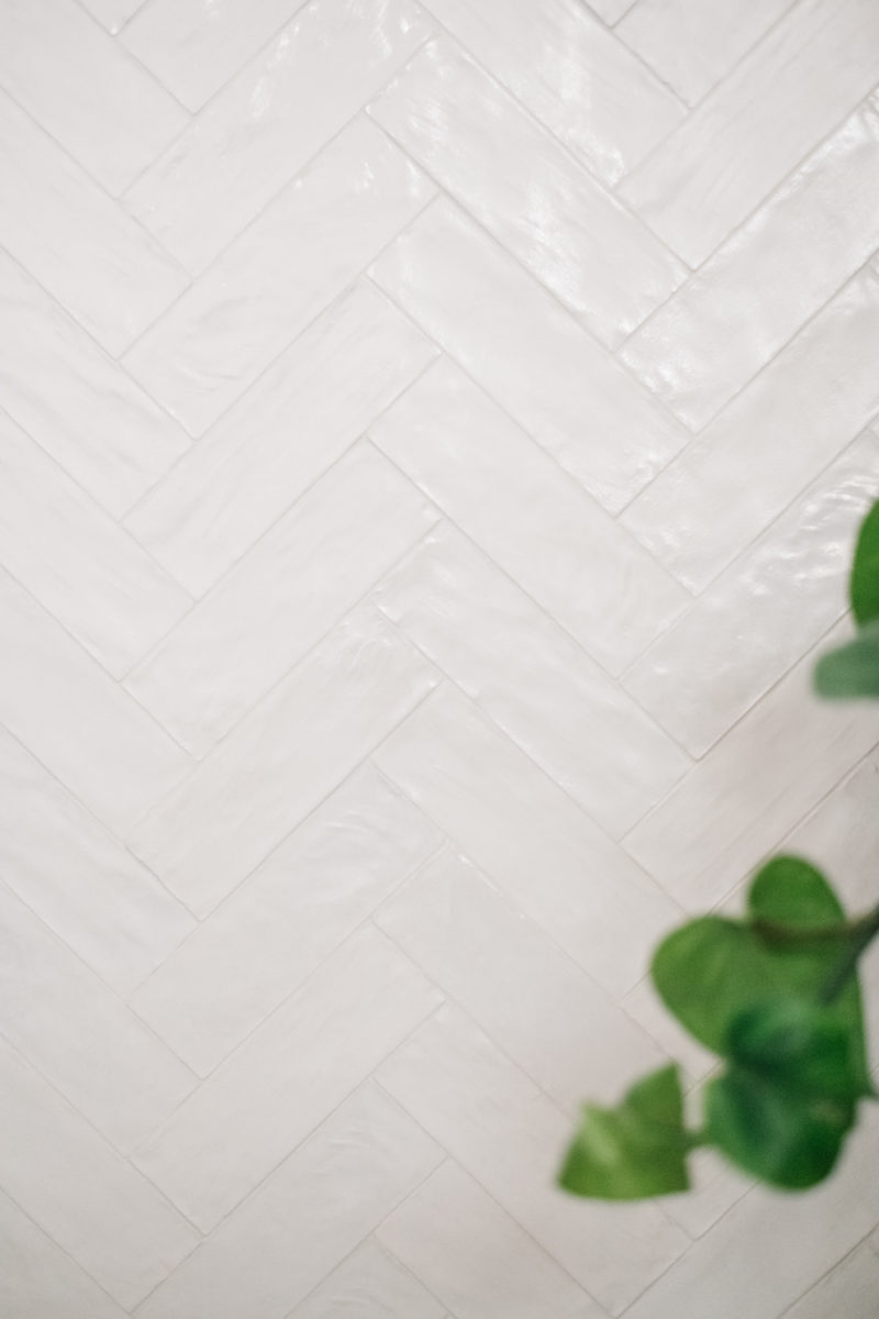
In the master bathroom we kept consistent with the Kitch Natural Halifax Oak fronts for the vanity as well as the Hanstone Canada Whistler quartz, then took another beautiful artisan tile chosen by the Kresswell designers up the wall of the vanity. In the shower we did a simple glass enclosure and a stunning artisan tile in a herringbone pattern.
Final Words
Taking on a big home renovation is not for the faint of heart. It was a long and expensive process but incredibly rewarding and we don’t regret it for a minute. This house has truly become our home and my hubby and I are incredibly thankful for the amazing professionals we had alongside us in the process. I’ll be doing a walk-through tour over on Instagram stories very soon so be sure to follow along there and be sure to check out and follow all of the amazing brands I’ve mentioned in the post!
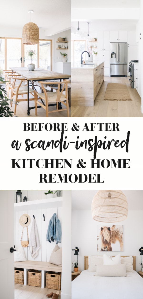
I’d be happy to answer any questions you may have about our renovation, the products we used, or where we sourced any of the pieces you see. You can also check out tips for home renovations on the Home Edit. I’d also love to know if you’ve done a renovation and what your experience was like! Leave your comments and be sure to pin the below (or any in the post) to save this post for inspiration and of course, share the love!
Pin me!
Disclaimer: This post contains links to Nutrition in the Kitch sponsors (Hanstone, Kitch, and Mitzi), all thoughts and opinions are my own.
All photography by Tracey Jazmin.


Hi there, Where did you get the hand railing/ stair baluster from?
Hi Naomi, we had it made locally by an iron working company!
Amazing transformation! We are doing a kitchen Reno and are using the Halifax Oak as well, it looks so lovely in your space 🙂 Question, where did you get your dining table from?
Thanks Susie! The Halifax Oak is seriously so beautiful in person too, has such a wonderful earthy feel to it! Our dining table is from Restoration Hardware, it’s the “Flatiron Table” made from reclaimed wood!
This is beautiful! I am considering Godmorgan for bathroom renovations as well and want quartz counter with under mount sink. Did the drawers need to be cut? Any advice regarding this?
Thanks Erin! We did have to notch out the top drawers in the Godmorgan to have the undermount sinks so the plumbing could fit, but it’s very minimal and doesn’t take away from much of the storage space which is nice! It’s essentially a small square notched out of the back of the drawer and the cabinet company who did the install just cut pieces to fit around it so it’s still a closed in drawer!
Where did you get your taps and black hardware from? Love the look overall!
Thank you! The taps are Delta trinsic line, and the hardware in the kitchen is Richellieu!
It is all so FRESH AND LIGHT! I didn’t see anywhere a mention of your sofa in the living room. Will you supply the info on it? Thank you
Thank you so much! Our couch is the Renfrew Sofa from Urban Barn!
Absolutely beautiful! Can you please share where you sourced the armchairs in the living room from? Love them!
Thanks so much Laura! Our chairs are the Simcoe chairs from Urban Barn!
It looks beautiful! We are currently doing a home Reno and also doing a Scandinavian inspired decor. Curious what color you painted your walls and trim?
That’s awesome, Reno’s are intense but a lot of fun too! We did the walls and trim in Benjamin Moore Chantilly Lace!
The house looks absolutely amazing, I love how natural and airy the house came out. Quick question, what color paint was used in the home? It appears to be the same color throughout, correct?
Thank you so much! We used Benjamin Moore Chantilly lace throughout the whole house!
So beautiful, time to make some wonderful memories.
Agreed!
Your house is beautiful, you both did a fantastic job with the renovations. Enjoy this new home, and make some beautiful memories.
Thank you!!
Its absolutely stunning, Christal! <3
Thanks so much Kim! <3