Check out the design details and the before pictures of part of our full home renovation of a 1970’s bungalow. The kitchen remodel is going to be spectacular and it’s an incredibly important part of this renovation as “the kitch” is my place to create for the blog!
‘The Kitch’ Kitchen Remodel
If you follow me over on Instagram you’ll likely have seen stories about what’s been going on lately with our home renovation. To give you the lowdown, in the summer my hubby and I bought a beautiful 1970’s bungalow (well, she’s a diamond in the rough right now…) to renovate top to bottom. We had been wanting a home with a larger yard and a little more space for our family (but not too much space!) in a mature, central, treed neighbourhood, and this 1500 sq ft bungalow totally fit the bill. The moment we stepped inside we knew it was the one! Aside from a big kitchen remodel, we knew the house would need renovations throughout but we were willing to take on the challenge with the help of our amazing design team, Kresswell Interiors, our contractor at Alair Homes, and Vera Kitchens who specializes in building beautiful kitchens with IKEA cabinets fitted with Kitch fronts (more on this shortly!).
This post is part of a 3-part series where I will take you through the Design, the Progress, and the Reveal! I am a huge fan of HGTV and following home renovations so if you’re anything like me, I hope you’ll enjoy watching this project come to life. I’m going to be putting the main focus on our kitchen remodel and main living area as this is where the true magic happens for the blog. On instagram you’ll be able to see sneak peeks of the other areas of our home including bathrooms, bedrooms, basement, etc. so be sure to follow along there!
Kitchen Remodel: Function and Style
When it comes to building my ‘dream kitch’ there are a couple key factors that come into play I’ll be covering in these posts; function and style. These three are hugely important because each one really helps to make a dream kitchen. Our new kitchen has to function well for our family meaning it must be easy to keep clean, easy to keep organized, and is laid out with intention, with the right layout, finishes, fixtures, and appliances. For style, I’ve always wanted to go with a more minimalist Scandinavian look that never feels cluttered but rather is airy and inspiring as this truly is my “office space”.
Meet the ‘Mint Beauty’ Before:
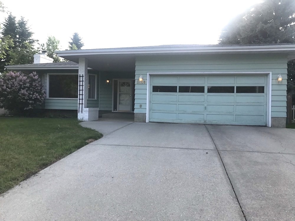
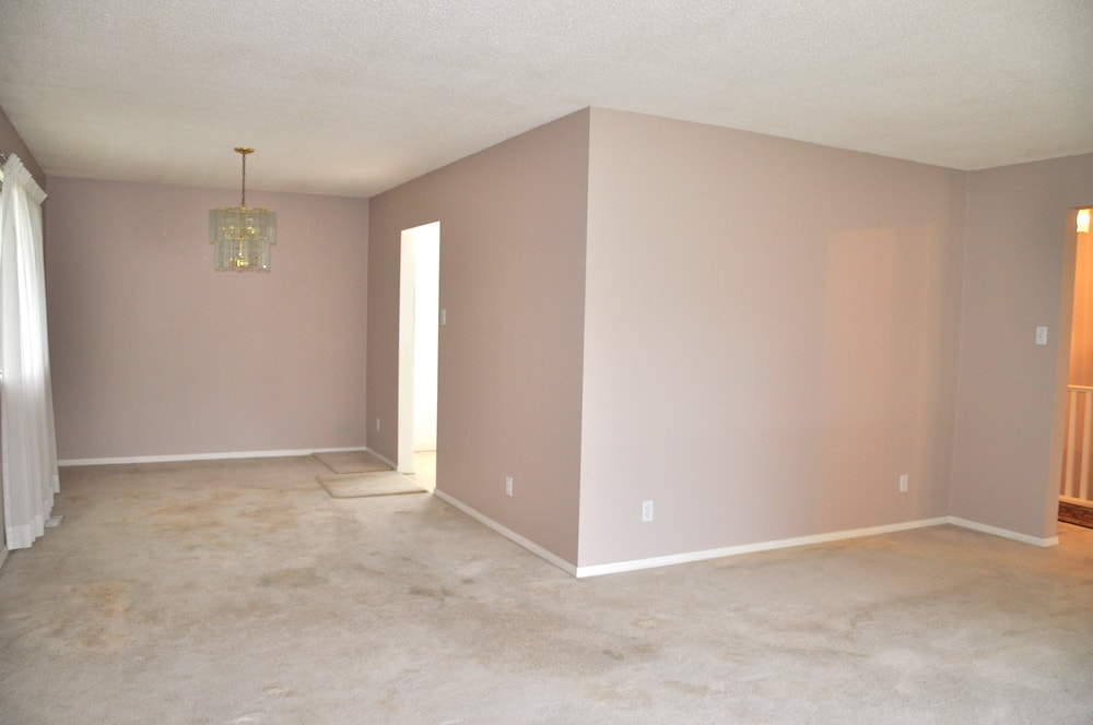
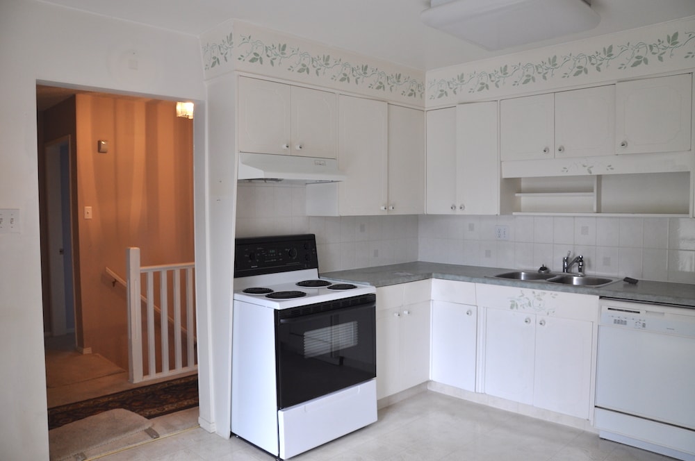
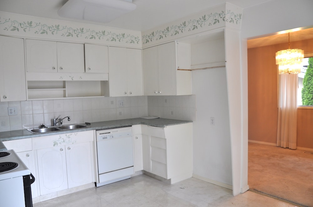
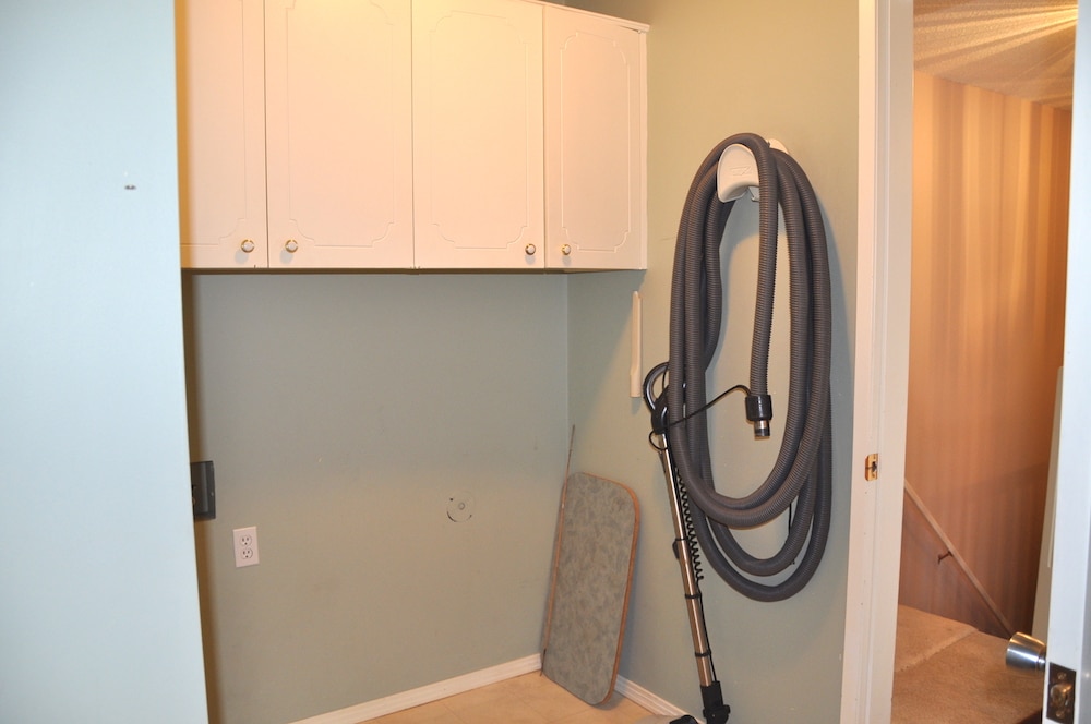
Here are some before pictures of our beautiful bungalow in all her mint glory. Now that we’ve completed demolition and the renovation has begun it’s almost hard to remember the house when it looked like this but it’s fun to go back and look at how far we’ve come already!
The exterior will be completely redone with all black trimmed windows, black siding, and a beautiful wood door for a pop!
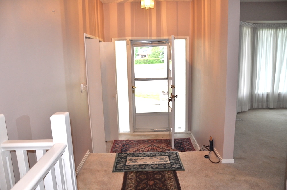
The entryway is large and inviting and will see the removal of the wall to the left where there will be a modern iron railing, a new large pendant light fixture, a transom window above the door and white oak hardwood flooring.
The living room looking towards the back of the house will have a complete transformation with both walls being removed and a large beam spanning across the living room. The back wall will have a 10 ft sliding glass patio door bringing in tons of west light! The kitchen island will be where the walls currently meet.
This old kitchen in all her glory has been completely torn down and will be the home of the new modern Scandinavian kitchen. The only thing that will stay the same is our new gas stove will remain in the same place!
This is the other side of the kitchen where both walls have been removed to make way for the large 9ft kitchen island which will host many future gatherings (and maybe cooking classes?!).
This cringe-worthy little space is what will become our beautiful Butler’s Pantry and Mudroom. A former laundry/storage/mudroom that will get a huge facelift and be a mini version and extension of our kitchen.
‘The Kitch’ Kitchen, Butler’s Pantry & Dining Room Design:
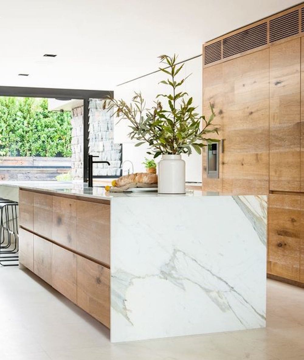
I will confidently say this over and over again, if you are doing a renovation or remodel, hire a designer or design team! The wonderful ladies of Kresswell Interiors have been a dream to work with and have helped Justin and I make countless decisions on everything from paint to flooring to hardware and door styles. They’ve made the design process pretty much a breeze and have helped Justin and I come to agreements when were weren’t on the same page. From the moment the ladies walked into our new place they knew it had so much potential and were able to ‘see’ beyond even what we could. Without having to explain it too much they understood that I was looking for an earthy-scandinavian-coastal-california-boutique-hotel vibe (lol! I have very specific taste!). Below you’ll see the Inspiration for our humble abode and the design concepts!
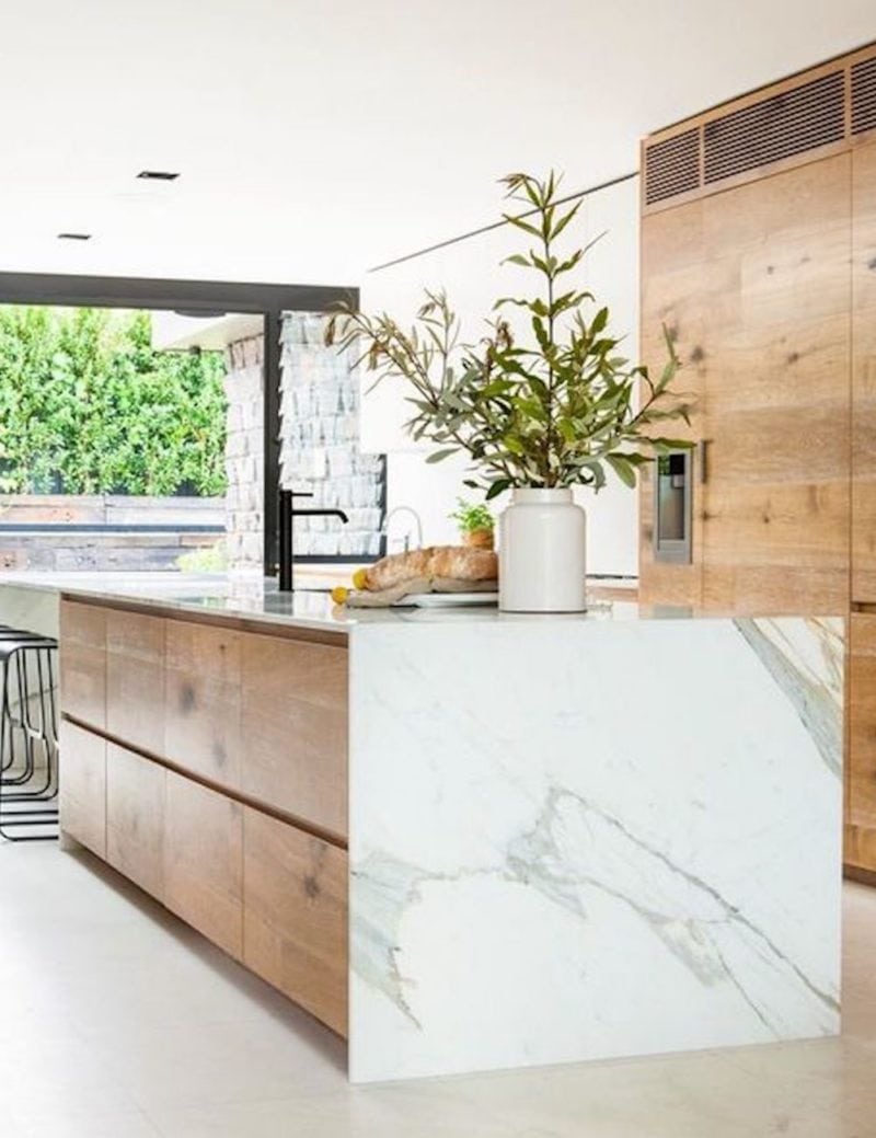
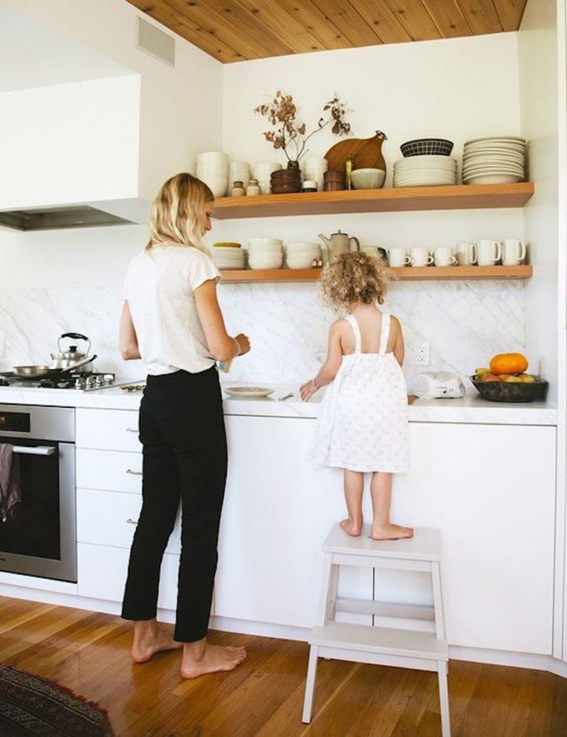
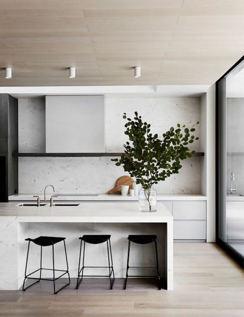
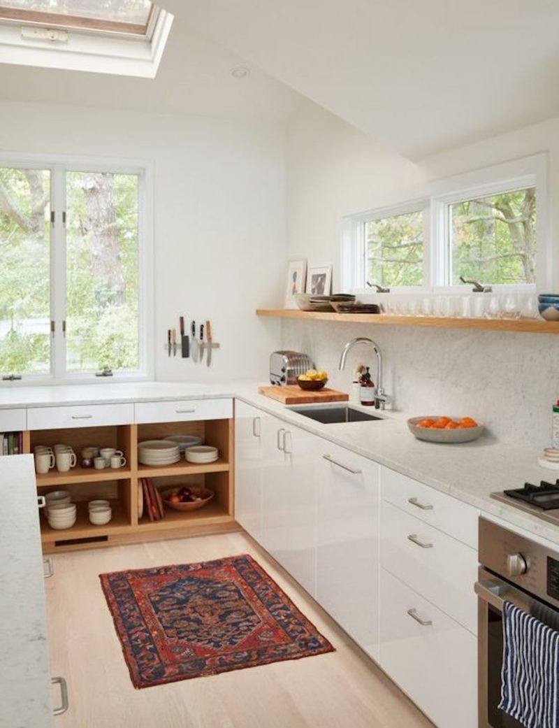
Kitchen Remodel Inspiration:
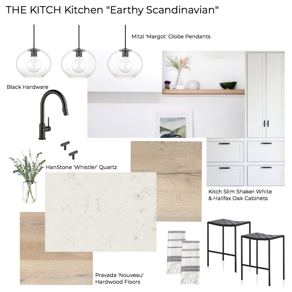
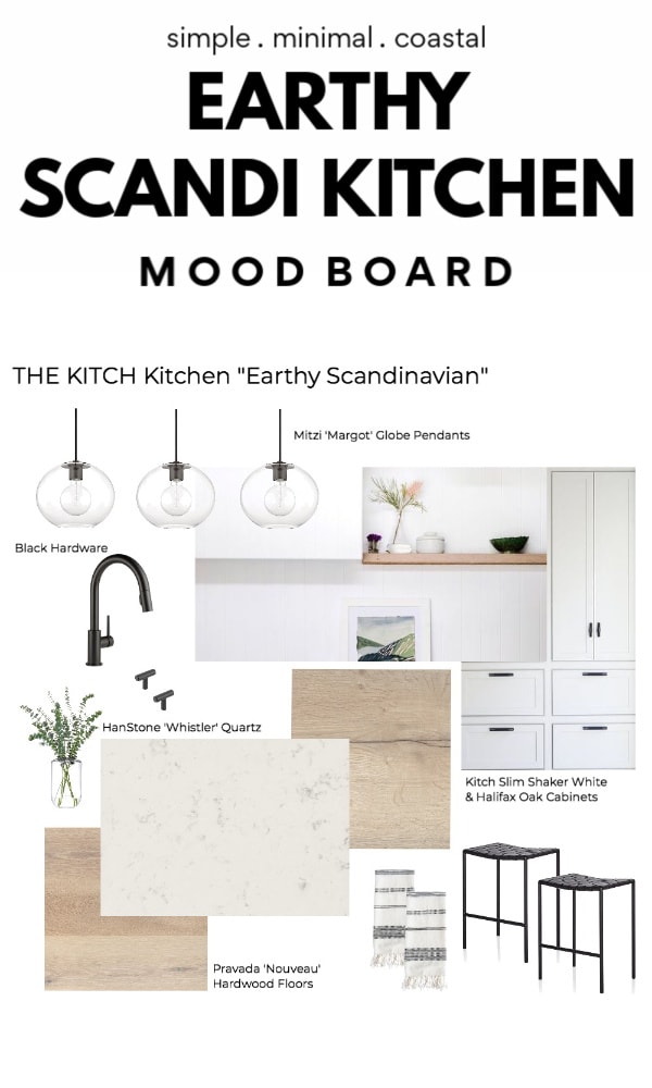
Kitchen Remodel Mood Board
IKEA & Kitch Cabinets:
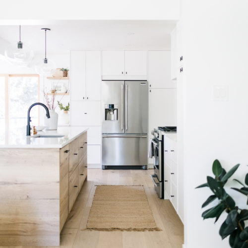
For the kitchen design we went with two different tones of cabinets, white and Halifax oak. For cost savings and versatility we decided to go with Vera Kitchens who specializes in creating IKEA kitchens with custom cabinet fronts by Kitch. When I first heard of Kitch I was thrilled to know they had so many options, over 100 cabinet door surfaces, to create a unique look to an IKEA kitchen which is on the more affordable side when doing a full kitchen remodel. I visited the Kitch showroom in Edmonton and checked out the different fronts and with the help of the designers settled on the Slim Shaker in Stratus as well as the Halifax Oak. The modern white along with the warm, natural wood is exactly what we wanted to achieve that earthy and airy look. The Halifax oak also blends wonderfully with the warm wide plank hardwood floors that will run throughout the entire main floor. We carried the same cabinetry into the Butler’s Pantry which I’ll cover next!
HanStone Quartz Countertops & Backsplash:
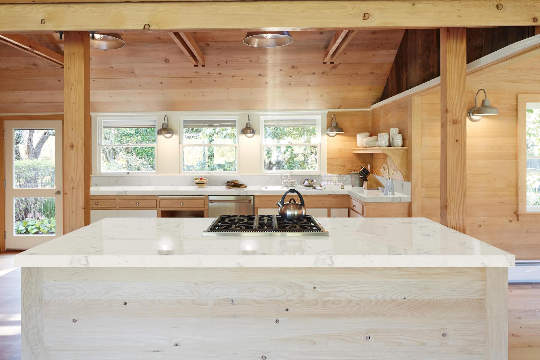
For the countertops we wanted a light and airy modern look for style but also durability for function. I love the look of marble but it just didn’t fit for us as it’s much higher maintenance, can easily stain, and is pricier so we went with a beautiful marble-look quartz from HanStone Canada, the “Whistler” from their Boutique Collection. This quartz is inspired by the mountain peaks and charm of Canada’s most luxurious ski town, Whistler as it has a purist white foundation speckled with warm grey veining, very minimal, subtle and perfect in large amounts. Because the beautiful HanStone quartz is so subtle we decided to take it right up the backsplash for a clean and seamless look. The quartz will run up the back wall of the kitchen to meet a single floating shelf in Halifax Oak custom made by Kitch.
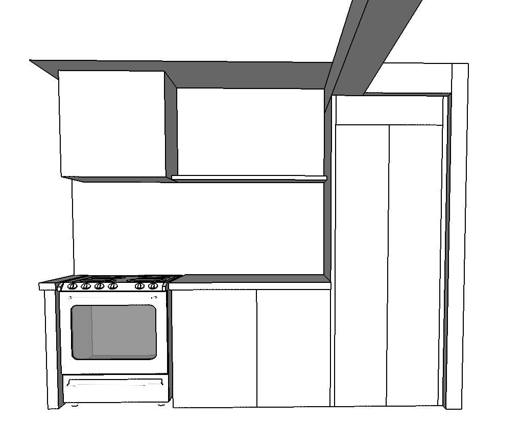
This little rendering shows the north wall of the kitchen where the gas stove will be with a white boxed in range hood for a modern look, the Kitch floating shelf in Halifax oak and the Kitch Slim Shaker Cabinets in white. The backsplash will be the HanStone Whistler Quartz. At the top you’ll see the large beam which will be capped in a wood veneer meeting the cabinets. This was a tricky design the Kresswell team had to come up with as the structural beam wasn’t in the greatest spot but they definitely made it work!
Mitzi Lighting & Hardware:
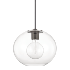
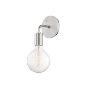
One design feature we decided would add the perfect pop of contrast was little touches of black throughout the house which has an overall airy and light vibe. The ladies at Kresswell Interiors suggested bringing in black in some of our light fixtures, hardware, and faucets. Lighting is so important in every space, especially the kitchen, so we decided to go with three beautiful glass globe pendants from Mitzi with the perfect touch of black. The lights are the Mitzi Margot pendants in old bronze and are sophisticated, stunning, and also don’t break the budget! We also went with Mitzi lighting in our living room, the Chloe Sconce beside our fireplace, and the flush mount Margot lights in the hallway and Butler’s Pantry.
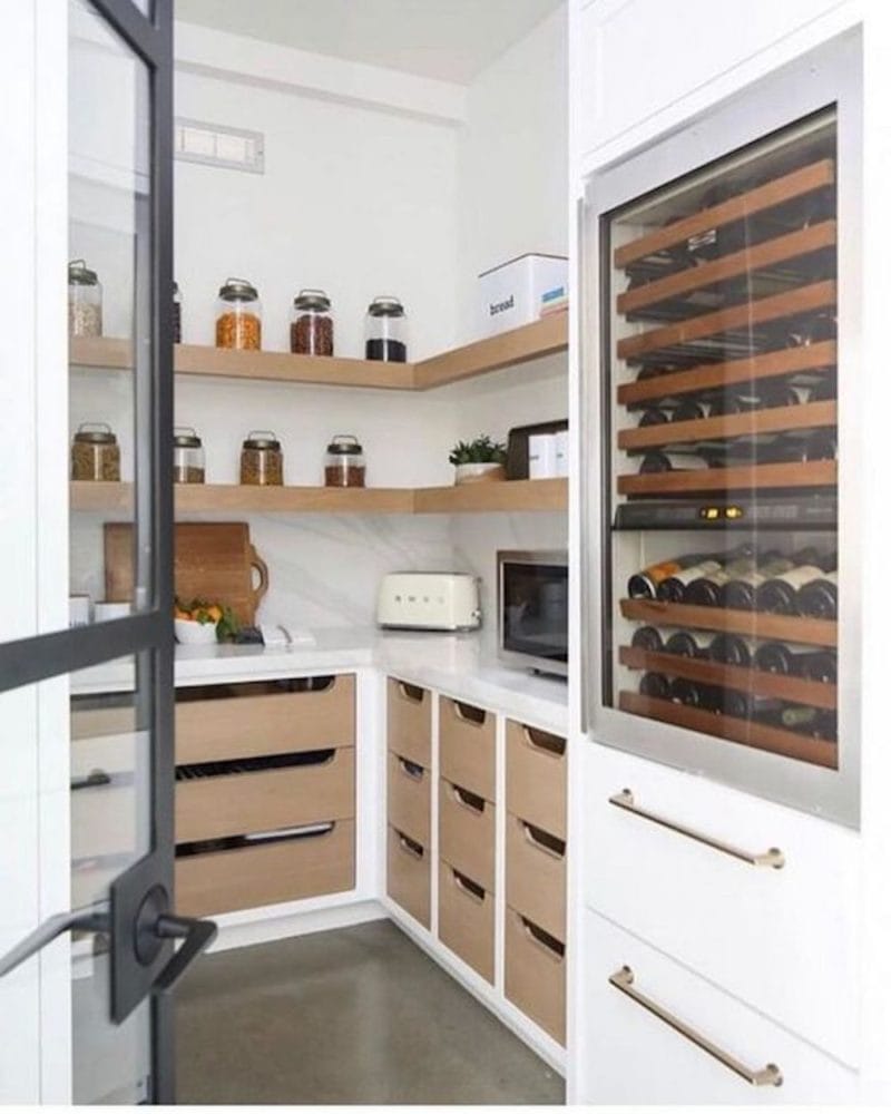
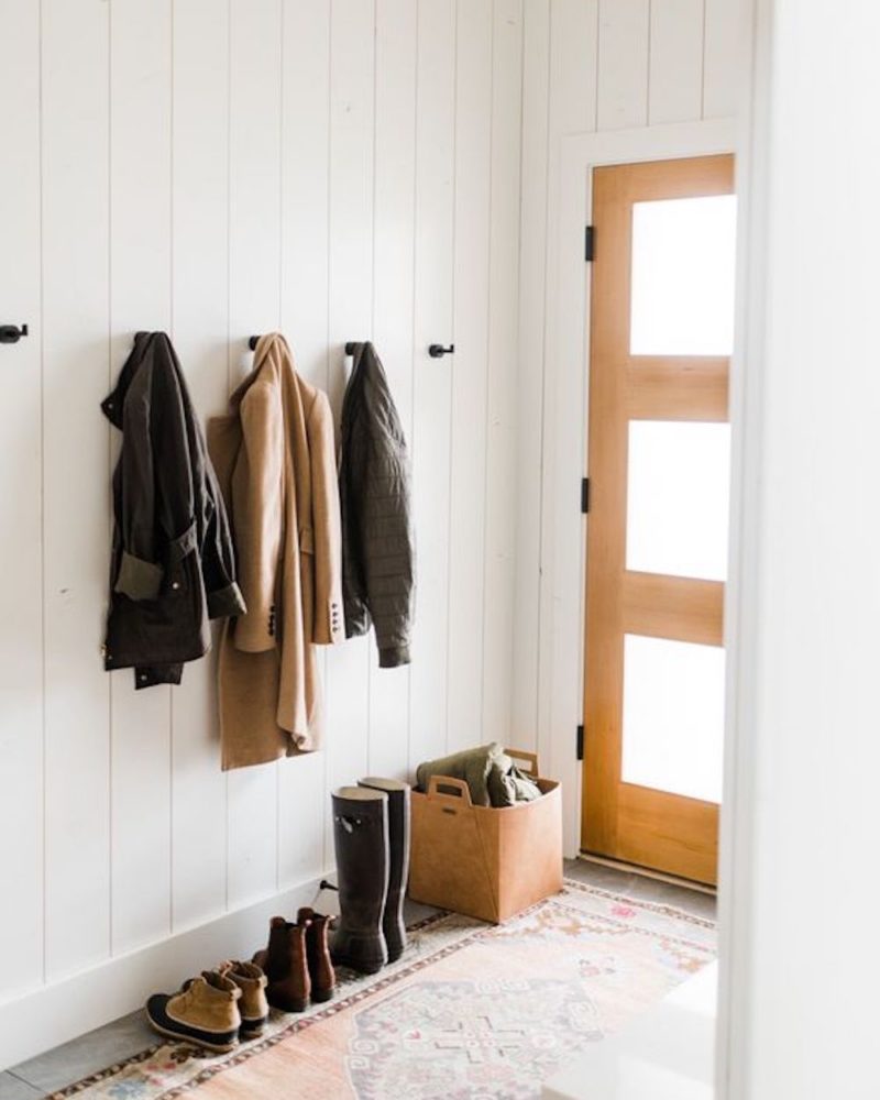
Butler’s Pantry & Mudroom Remodel Inspiration:
Just around the corner from our kitchen is a room that will double as a Butler’s Pantry and Mudroom. This space was originally intended as a mudroom/laundry but we decided to relocate the laundry downstairs to give us additional kitchen space for storage and preparation.
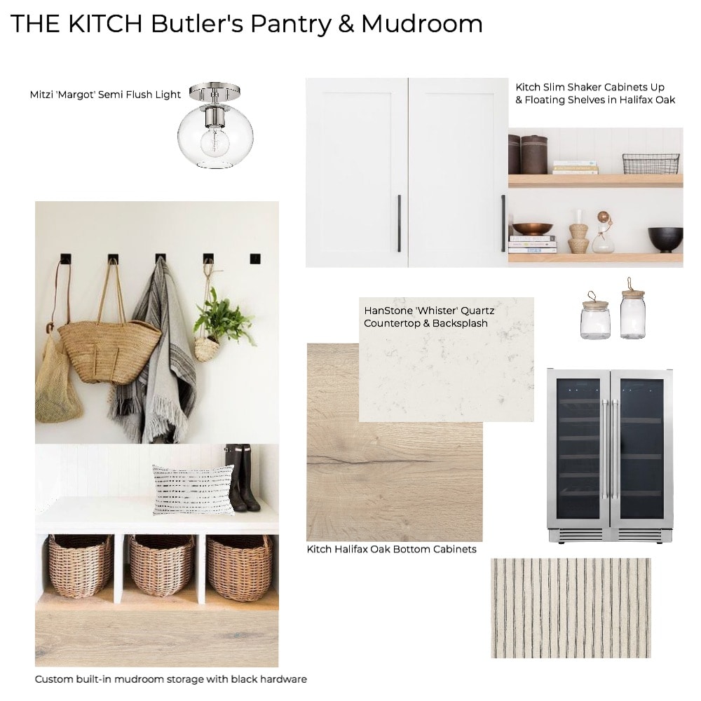
Butler’s Pantry & Mudroom Mood Board
For the butler’s pantry we decided to mimic the kitchen with the HanStone Whistler Quartz countertop and carrying the countertop up the backsplash to meet two floating shelves. I am so excited to see this space come together as while it might be a little “hidden” this small space will serve mighty purposes…this is where the wine will be stored, ha! All joking aside, I think this space will be perfect for extra kitchen storage and doing the extras while hosting friends and family. We will also have Kitch Halifax Oak cabinets on the bottom with two custom floating shelves and a Kitch Slim Shaker cabinet on top beside the open shelving.
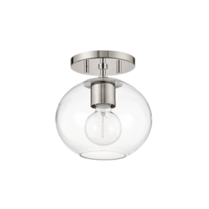
The room will be illuminated by a practical and pretty Mitzi Margot flush mount pendant in Polished Nickel and the mudroom side will have custom built ins for show storage, coats, and more. I know this room is going to be used all the time and will make a great space for keeping the clutter off the counters, out of the front entry way, and off the floors! Function and style.
Dining Room Remodel Inspiration:
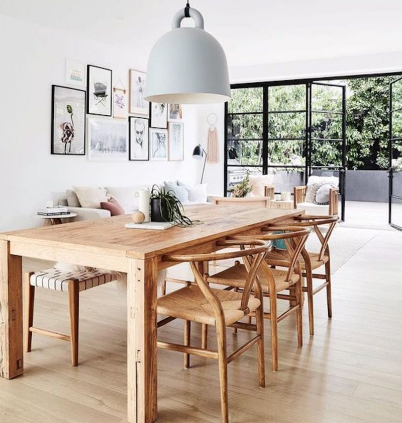
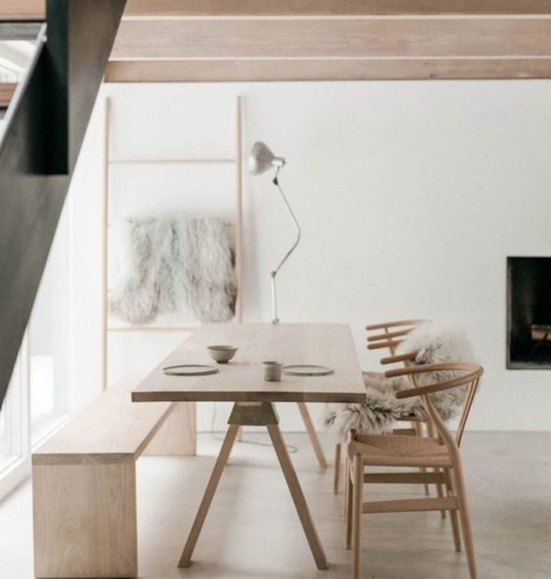
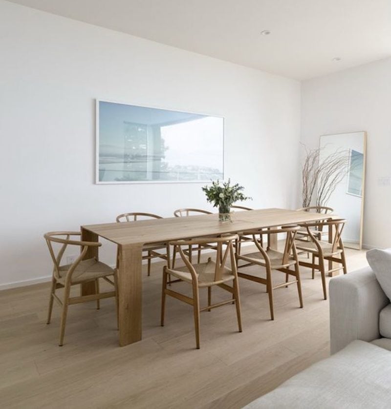
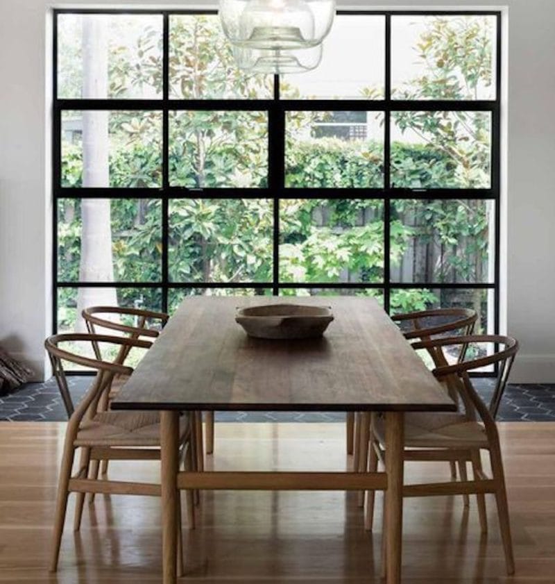
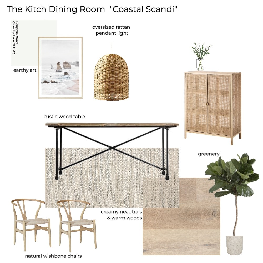
Justin and I love to host friends and family and for years we’ve felt like our space worked but was a little cramped. With our new kitchen and dining room layout we believe we will be able to host often and with the little bit of extra space we need for everyone to gather and relax. Our dining room has that earthy Scandinavian vibe with a touch of coastal flare (if I can’t live by the ocean, I’ll bring a bit of it inside!).
Dining Room Mood Board
For this space the centrepiece will be our beautiful reclaimed wood dining table that spans over 9ft. We’ve had this table since we got married and it’s hosted many gatherings and we hope there will be many more. Our goal is for the dining room to be it’s own unique space but still blend seamlessly into the kitchen and living areas. We will be painting the entire house Chantilly Lace by Benjamin Moore and feel it will create the perfect clean and bright backdrop for the earthy, neutral, minimal and inviting decor.
As you can see we have a BIG job ahead of us. While things are underway there isn’t much to share yet in terms of progress as I want to wait until we have drywall up and each of the spaces begin to take shape. In the meantime I would love to hear your thoughts and comments on the design and if you’ve ever been through a home renovation or kitchen remodel! Also, be sure to pin the photo below to save this post for later or for your own inspiration!
More Home Renovation Posts To Check Out:
‘The Kitch’ Kitchen & Home Remodel Pt 2: The Progress
‘The Kitch’ Home & Kitchen Remodel Pt 3: Final Reveal
Disclaimer: This post contains links to Nutrition in the Kitch sponsors (HanStone, Kitch, and Mitzi), all thoughts and opinions are my own.


This is so exciting!! I love all your inspiration and what you are describing!! I can’t wait to see it come together Christal!
Thanks so much Allison! It’s a big process but super exciting!